Do visitors open your homepage and leave a few seconds later?
Your homepage is the first thing a potential customer sees, and it is doing more work than any other page in your store. It has to make sense instantly, point people at the products they came for, and give them a reason to keep scrolling. Building a homepage that increases your sales is less about decoration and more about removing steps between arrival and checkout. In this guide, you'll learn what your homepage needs to achieve, which sections to put above the fold, how to use images and customer reviews, and what belongs further down the page or in the footer.
A homepage that sells keeps navigation short, puts the cart within easy reach, leads with one strong offer, and shows new products, live chat and customer ratings. Everything secondary — blog content, contact details, FAQs, policy pages — sits below the fold or in the footer, where shoppers instinctively look for it.
📌 Article overview
- What your homepage design needs to achieve
- Ideas for presenting your main sections
- Using images that hold attention
- Customer reviews and questions
- The rest of the homepage and the footer
- Frequently asked questions
What your homepage design needs to achieve
On average, a visitor spends 10 to 20 seconds on your homepage. In design terms that means the navigation has to be obvious enough for someone to pick the right path — for them and for your business — almost immediately.
If you are weighing up design options and are not sure which direction to take, work through these questions first:
- How easily can people reach your homepage, and do you have a branded domain?
- What do you want the visitor to do? Place an order, join your mailing list, something else?
- How simple is it for them to do that?
- How many steps does it take to complete your goal?
- How much information do they need before the next step?
- Are there any steps you can remove?
🚀 Ideas for presenting your main sections
Keep the top of the page short
Research suggests short-term memory holds around seven items at a time, so a homepage crammed with links at the top leaves visitors feeling lost rather than oriented.
If you carry a lot of products and collections, put only your top-level collections in the homepage navigation and use a mega menu or a dropdown for everything underneath.
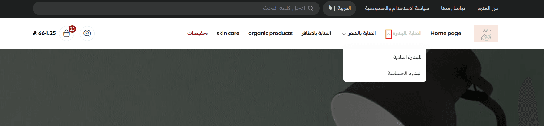
Make the cart easy to reach
The cart is part of the furniture on almost every e-commerce homepage, and it needs to be findable without thinking. The cart in Salla stays visible in the header throughout the entire browsing experience, so customers can check it at any point.
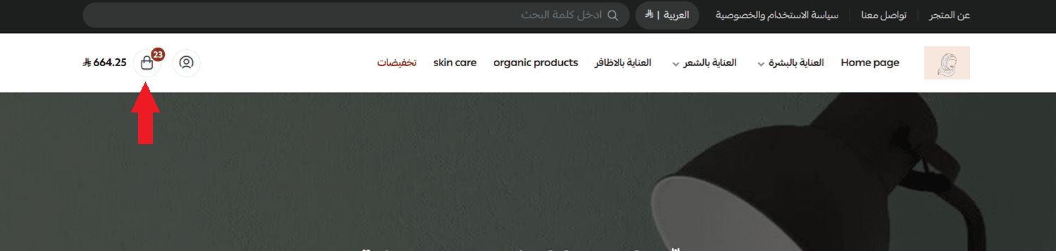
Make it obvious where the cart is and how to open it.
Keep navigation simple
A homepage navigates well because it is simple, which makes sense once you consider how quickly people jump from one page to the next online.
Getting to a destination should take as few clicks as possible, with priority given to the paths most of your visitors actually need.
Lead with a deal or a free gift
Your homepage is the first impression, so give shoppers a reason to buy right there. Everyone responds to a discount.
Announce free shipping or a first-order coupon at the top of the page, promote offers and discount codes through the announcement bar above your store, or send them as a notification in your store app.
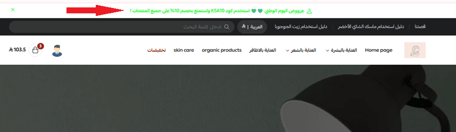
For more details, see customizing the promotional bar at the top of your store.
Show the new collection
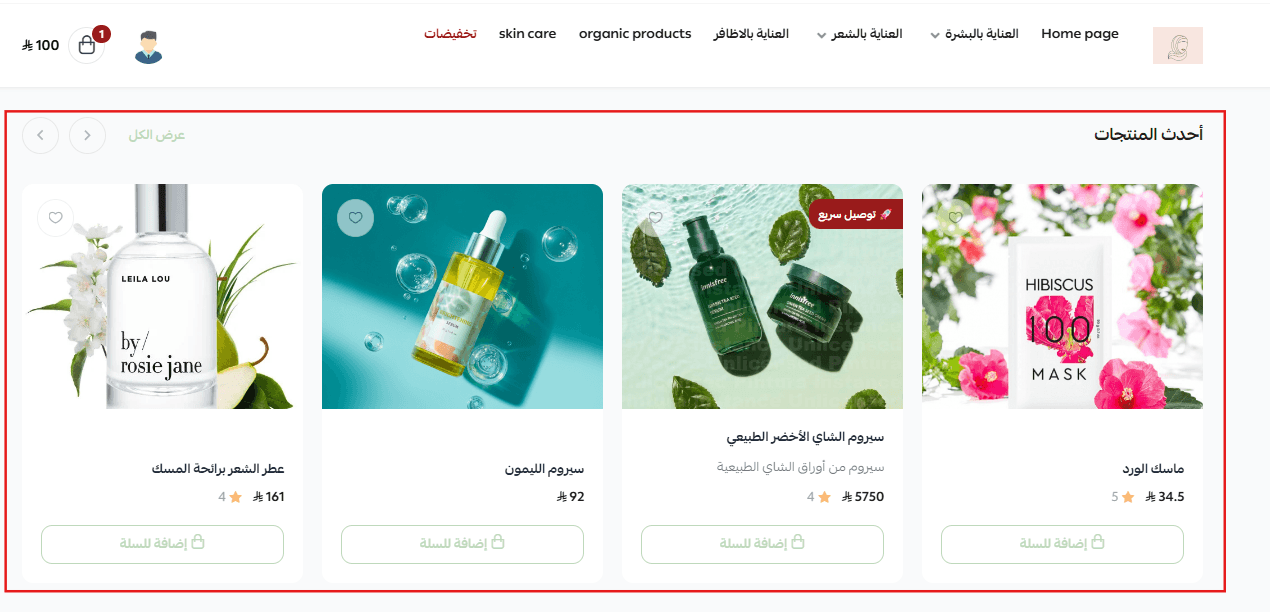
Give your best sellers and your newest arrivals a dedicated section on the homepage. It is the fastest way for a returning customer to see what has changed since their last visit.
Offer live chat
Live chat has become standard on e-commerce sites. Customers have questions they want answered while they are still on the page, and keeping chat available on the homepage helps convert those questions into orders.
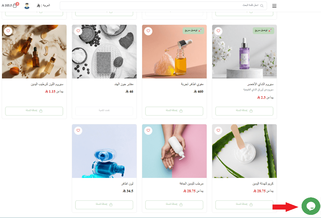
Salla supports several live chat services. The service integrations section of the Help Center covers how to connect each one — for example:
For more details, see connecting Tawk.
For more details, see connecting Tidio.
Using images that hold attention
Knowing how little attention you have makes it easier to decide what deserves the space. Whether you are promoting a product, a collection, or trying to capture leads, the job of your visuals is to catch the visitor the moment they land.
High-quality product photography that shows the details customers actually care about is what earns that attention.
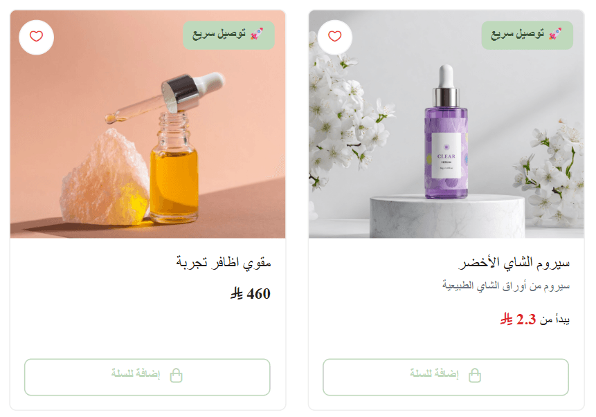
There are two ways to place promotional imagery on the page:
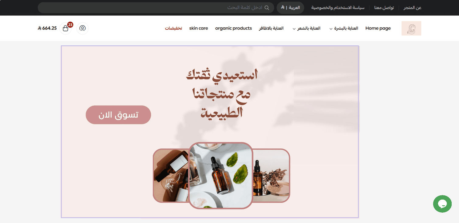
- Image with text
One strong image and one call to action. This works best when you want a single hero offer above the fold — a limited-time sale, a flagship product, or a seasonal collection.
- Slideshows
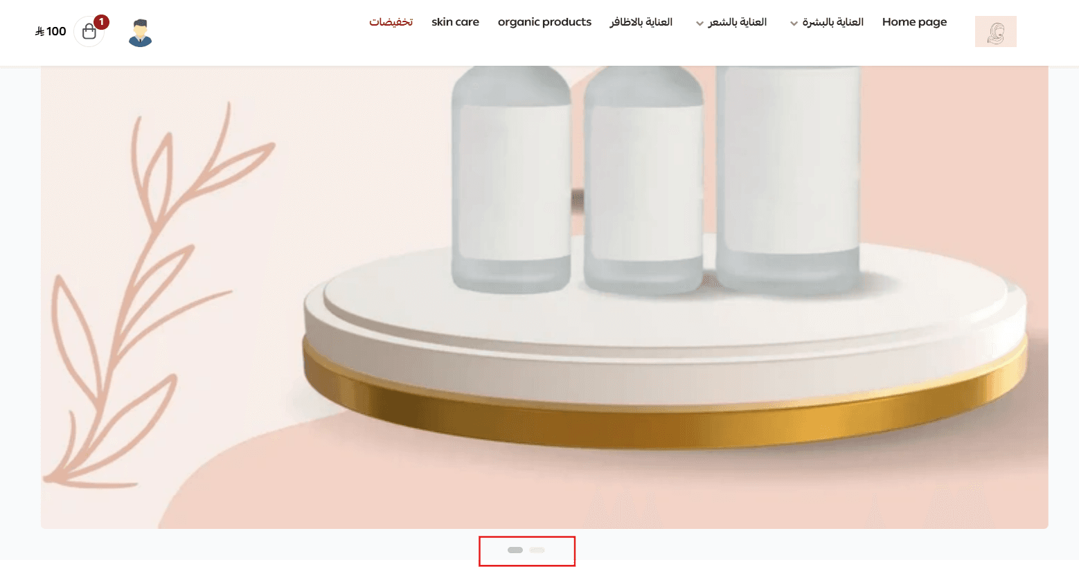
Each slide can announce a different sale, product group, or high-quality product shot.
Order the slides by priority, with the most important one first, and keep it to around three slides — nobody watches a single slide for long before moving on.
For more details, see customizing your homepage components.
Customer reviews and questions
- Store and product ratings
A positive rating on your store and your products is a customer recommending your brand on your behalf, and it does more for a hesitant shopper than any description you write.
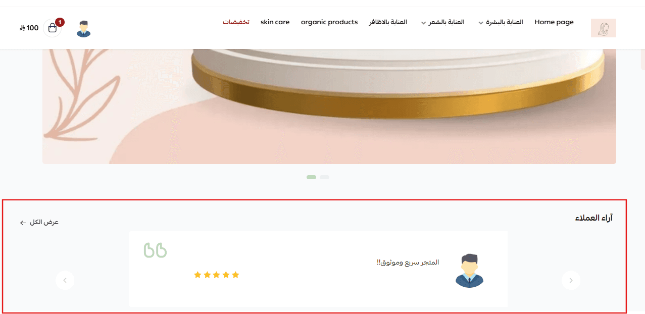
For more details, see rating settings.
- Replying to customer questions and order reviews
Your dashboard is where you manage ratings and reply to customer questions and reviews, so nothing sits unanswered on a product page.
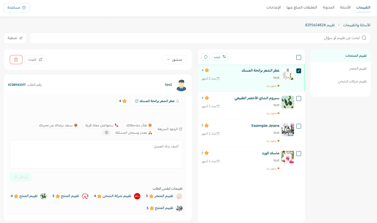
For more details, see questions and ratings.
The rest of the homepage and the footer
What sits below the fold is not automatically less important. It usually reinforces and expands on what you have already said, gives shoppers a second route to the same conversion, and keeps other pages within reach for the customers who need them.
Here is a short list of elements worth including in your homepage design or your footer, depending on how central they are to your goals.
Blogs, videos and other content
Blog and video content is good for SEO, but placing it above the fold pulls attention away from your products. You generally want content leading people toward what you sell, not away from it.
Put links to your content below the fold or in the footer — especially if content is not central to your business — and let the visitors who want to explore find it.
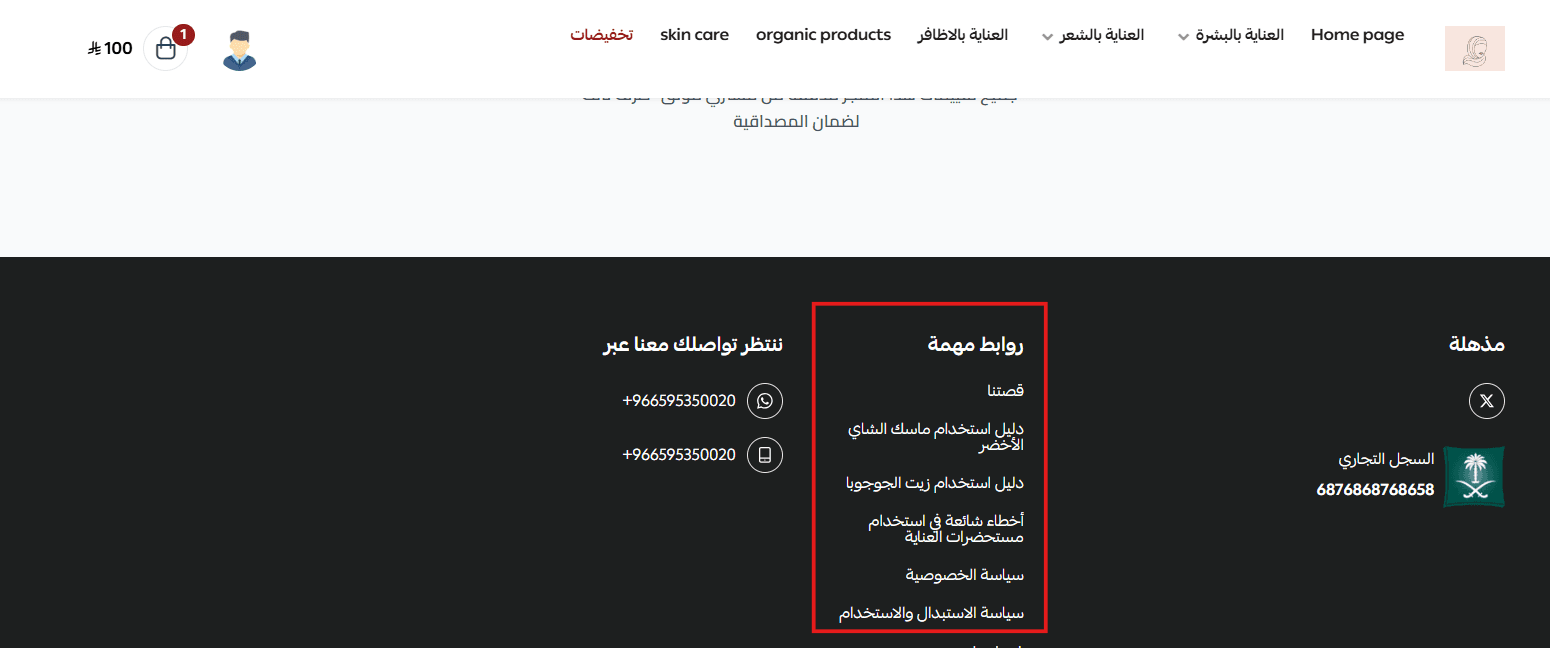
For more details, see managing your store pages.
Contact us
If a customer wants to reach you, your contact details should be on the homepage itself. Nobody wants to hunt around a store to find out how to get in touch.
For more details, see customizing your footer.
Questions and answers
Shoppers arrive with questions, and not everyone wants to speak to a sales rep to get them answered. An FAQ section is the simplest way to handle that. Keep it updated as new questions come in.
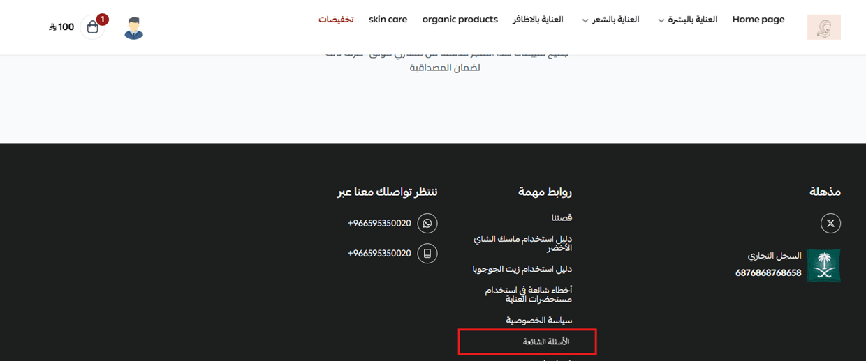
For more details, see questions and ratings.
Terms of service and return policy pages
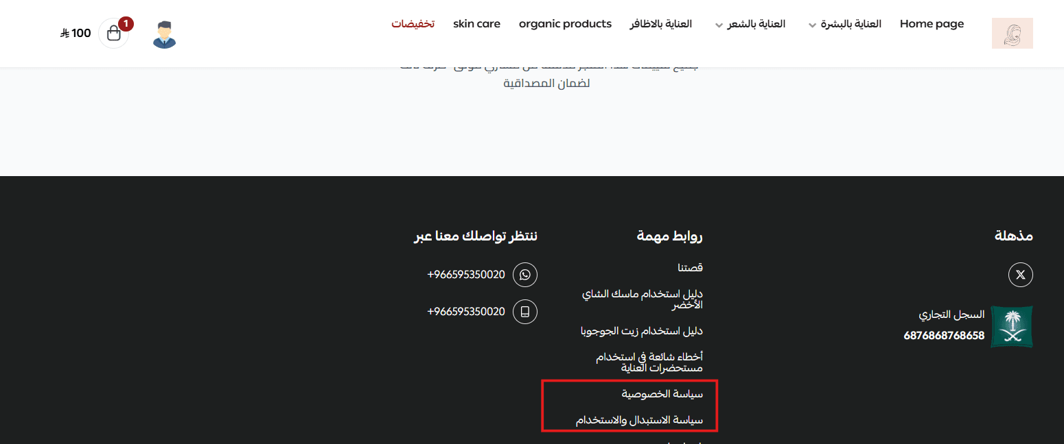
Pages like terms of service, the privacy policy and the return policy generally work best in the footer. Because that is where these links usually live, most visitors look there instinctively when they need them.
If one of them genuinely helps people decide to buy from you, or supports another key goal, consider promoting it to the top navigation or into the homepage design itself.
For more details, see managing your store pages.
📝 Important notes
Every element you add to the top of the homepage competes with the others. If a section is not helping someone buy or navigate, move it below the fold.
Keep your slideshow to around three slides and order them by priority — most visitors never reach the last one.
Frequently asked questions
❓ How long do I have to make an impression on my homepage?
Roughly 10 to 20 seconds. That is why the navigation and the main call to action need to be obvious the moment the page loads.
❓ How many sections should sit at the top of the homepage?
Keep it short. People hold only around seven items in short-term memory, so lead with your top-level collections and push everything else into a mega menu or dropdown.
❓ Where should I put my blog, policies and contact details?
Below the fold or in the footer. That is where shoppers instinctively look for them, and it keeps the top of the page focused on products and offers.
❓ Can I add live chat to my store?
Yes. Salla supports several live chat services, including Tawk and Tidio. The service integrations section of the Help Center covers the setup for each one.
❓ How do I promote an offer at the top of my store?
Use the promotional bar above your store to announce free shipping, a first-order coupon, or a discount code, or send it as a notification in your store app.
A homepage that sells is not the one with the most on it. It is the one where a visitor can tell, within seconds, what you sell and where to click next.