Many merchants struggle to clearly showcase their products and manage orders efficiently. This is where the Menu Template stands out. With its clean, structured layout for products, promotions, and alerts, combined with seamless order management and multiple payment options, the Menu Template offers a complete solution that enhances both customer experience and operational efficiency.
📌 Article overview
- Example use cases for the Menu Template
- How to design your app using the Menu Template
- Menu Template features
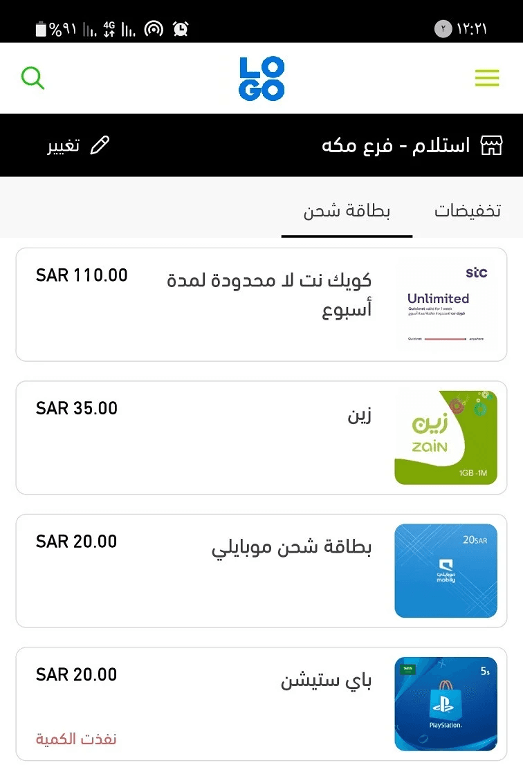
Example use case: Menu Template in action
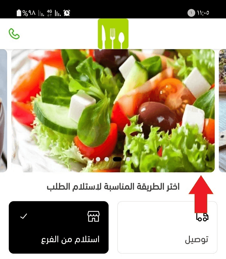
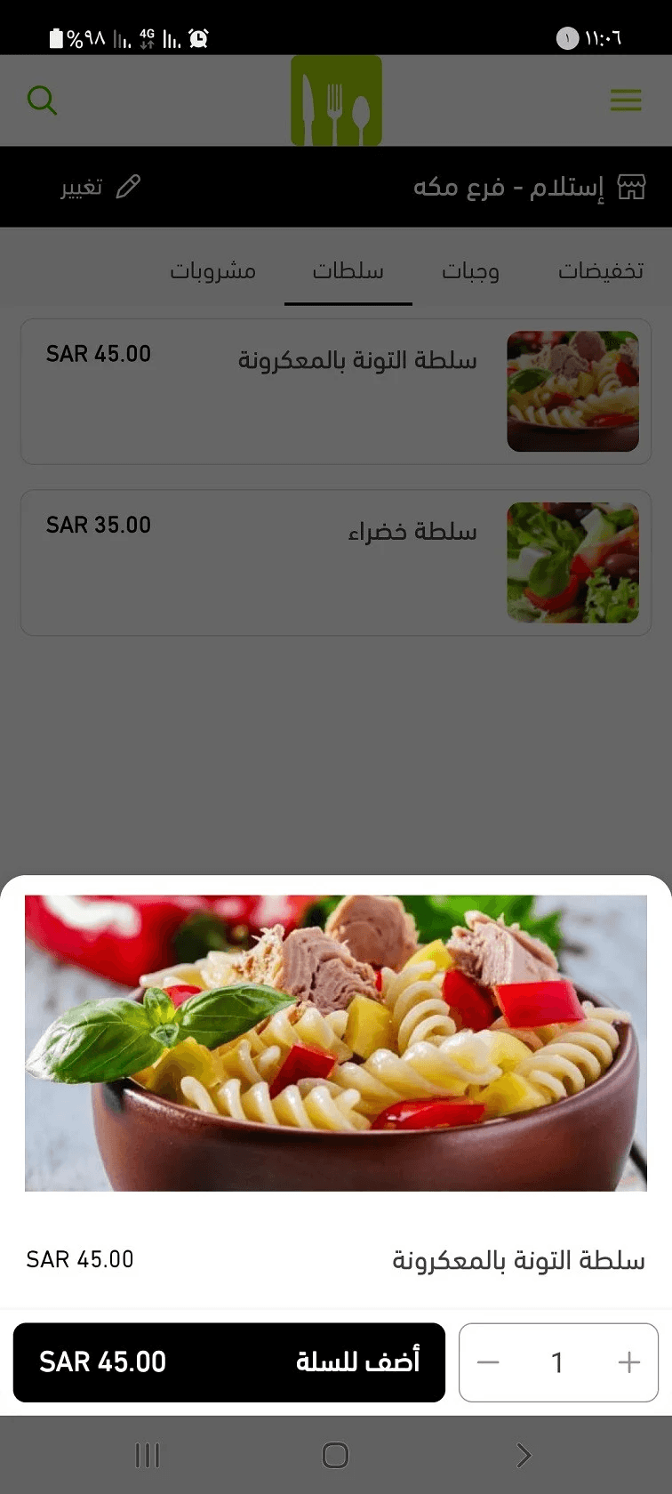
The Menu Template displays your products in a clear, list-based layout, similar to a digital menu. This structure makes it easy for customers to browse categories, compare items, and make decisions quickly.
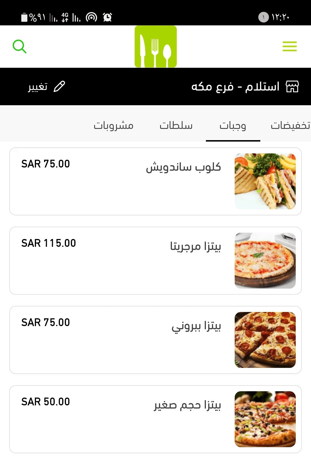
The Menu Template is not limited to food and restaurant apps.
It works perfectly for any business that wants to present products or services in a sequential, organized format, including:
- Retail products
- Service listings
- Digital cards and vouchers
- Subscription-based offerings
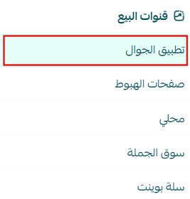
How to design your app using the Menu Template
- From the main menu, go to Store & Sales Channels, then select Mobile App.
2. From the app design page, click Change next to the currently active template.
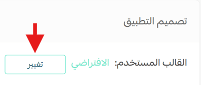
3. Select Menu Template from the available templates, then click Save.
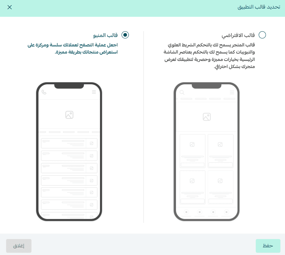
Menu template features
- From the main menu, go to Store & Sales Channels, then select Mobile App.
From the App Design page, you can control all template settings using the configuration panel.

Home screen settings
1. Animated header images
Add slider images that appear at the top of your app screens.
- You can upload multiple images
- Recommended image size: 1290 × 860 px
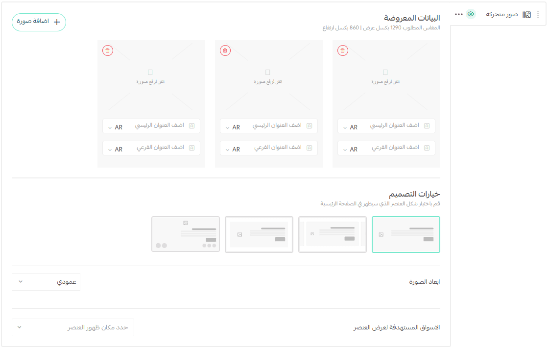
2. Choose your preferred product layout
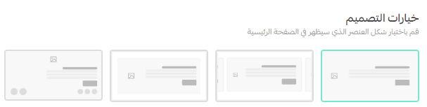
You can select from multiple display styles:
Option 1 (Image on the right)
Displays products as wide cards spanning the screen, with the product image on the left and key details (name, price, short description) on the right.
Option 2
Similar to Option 1, but with a wider layout. Product images appear larger, giving more space for text and details.
Option 3
Horizontal card-style layout where part of the next card appears on the screen, encouraging users to swipe and explore more items.
Option 4 (Image on top)
A clean, minimal layout showing the product image at the top, followed by the name and price, with small action icons (such as add to cart or favorite).
3. Image orientation
Choose whether product images are displayed in portrait or landscape format.

4. Targeted markets
Select where each element should appear:
- All markets
- Specific markets only
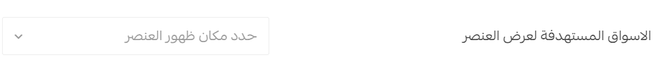
🔔 Important note: Targeted market display is currently available only for stores in Saudi Arabia.
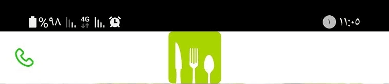
Top bar and tabs
From the Top Bar & Tabs section, you can customize these elements based on your brand and customer preferences.
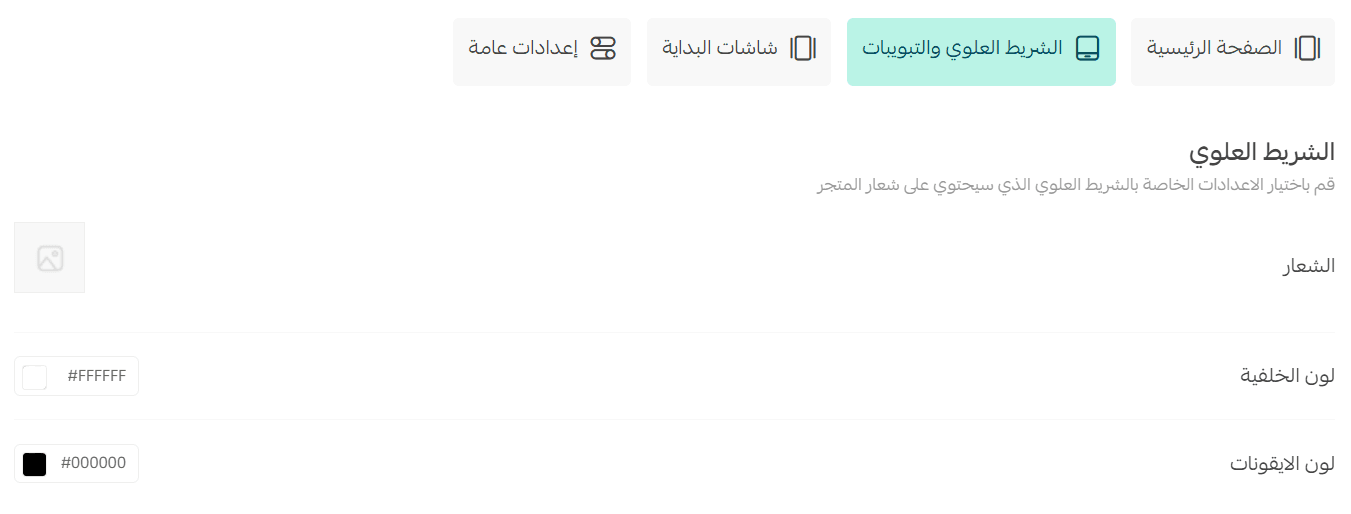
You can:
- Upload your logo
- Choose the top bar background color
- Customize icon colors
This ensures visual consistency and a strong brand presence throughout the app.
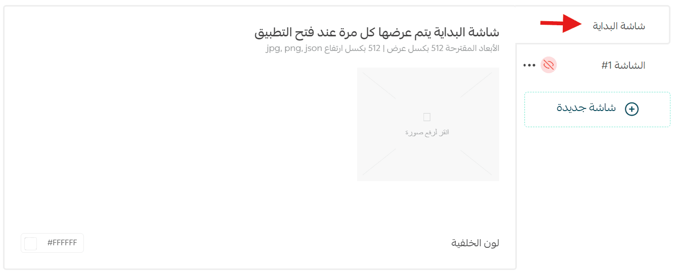
Launch screens
The app includes two types of launch screens:
1. Splash screen
- Appears briefly when the app opens (3–6 seconds)
- Creates a strong first impression
- Usually displays your logo or app name on a simple background
- Allows time for initial app loading
2. Onboarding screens
These screens appear only once, when users open the app for the first time after installation.
Their purpose is to:
- Introduce the app
- Explain key features
- Guide users through their first interaction
To customize onboarding screens:
- Click Add new screen
- Upload images optimized for all screen sizes
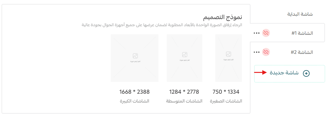
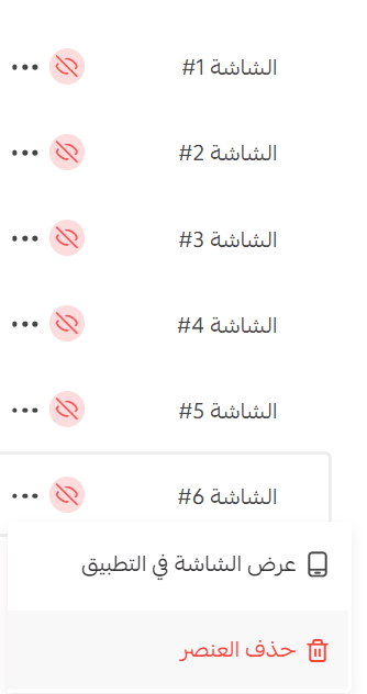
You can add up to 6 onboarding screens, remove any screen using (...), or hide it without deleting it.
General settings
From General Settings, you can customize:
- Loading indicator style
- App primary color
- App font type
- Product image display mode (full image or contained)
- Product image size on the product details page (default or large)
- Visibility of custom fields on the product card
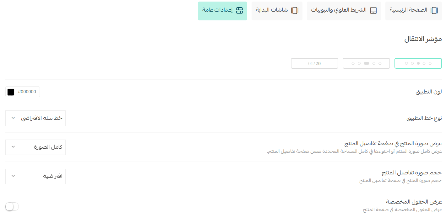
These settings allow you to fine-tune the app’s look and feel to match your brand and audience expectations.
⚠️ Important:
Always click Save Design after making changes to ensure your updates are applied successfully.