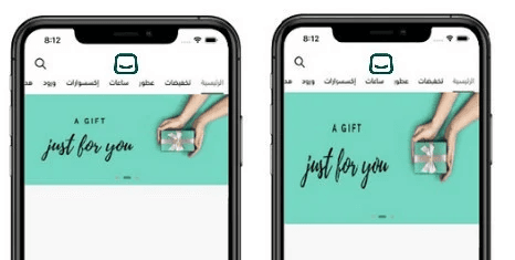
The Home Page is the first experience customers have when they open your app. It’s where you control what appears, how it’s arranged, and how your brand is presented.
Using the default template, you can add, organize, and customize Home Page elements such as sliders, banners, product sections, menus, and store highlights, creating an engaging, intuitive experience that reflects your brand identity and encourages customers to explore and buy.
📌 Article overview
- Designing the home page using the default template
Designing the home page using the default template
1. Open the App Maker
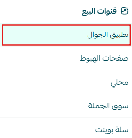
From the main menu, click Store & Channels, then select Mobile App.
2. Open the Home Page Tab
From the app design section, select Home Page, then click Add New Element to start building your layout.
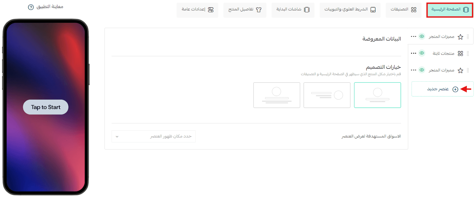
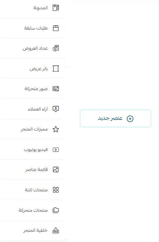
3. Choose Home Page Elements
A list of elements will appear, allowing you to add and customize components for the Home Page of the default template.
Multi-Market Display
After adding and customizing an element, select the markets where you want it to appear, then click Save.
You can:
- Display the element in all markets
- Display it in specific markets only

🔔 Important: The Multi-Market feature is currently available only for stores in Saudi Arabia.
Home Page Elements
1. Blog
The Blog element appears in the app only if the following conditions are met:
- The Blog app is installed and activated
- Published blog posts exist
- The Blog element is enabled and set to display in the app
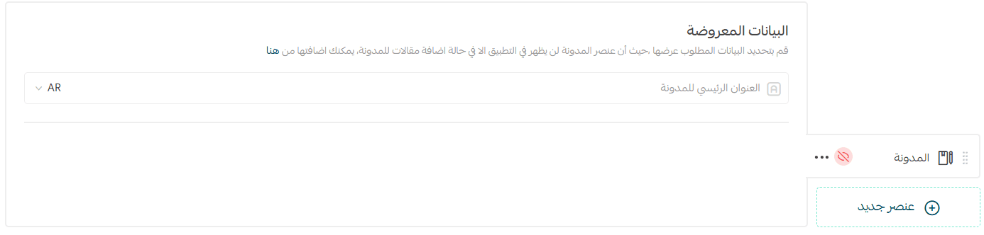
📖 Learn more: Managing Your Store Blog on Salla
How it appears:
- Displayed as a horizontal slider of blog posts
- Shows blog title, cover image, article title, publish date, and author
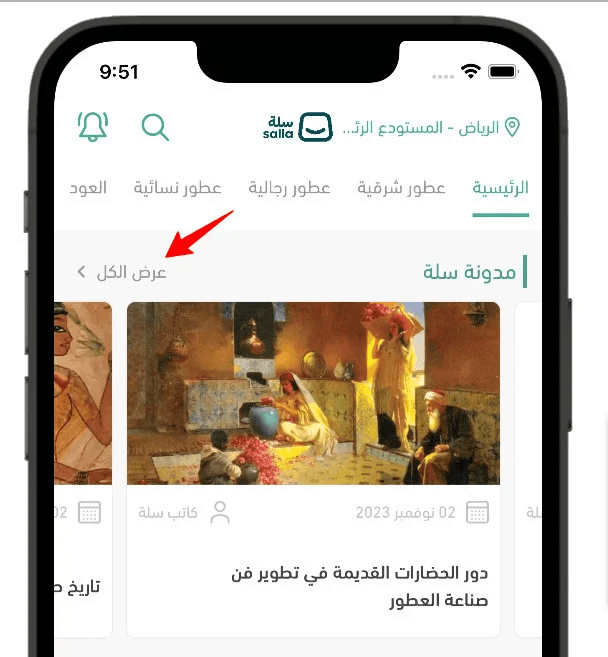
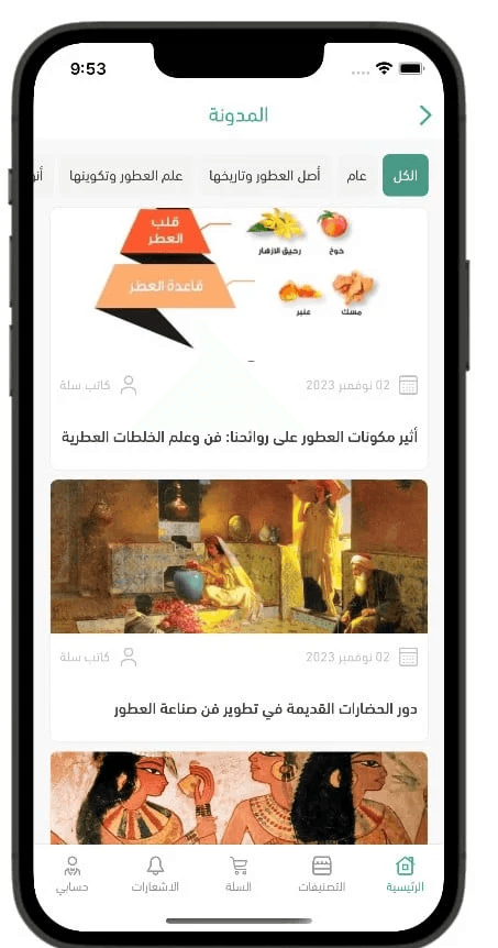
Clicking View All opens:
- Blog categories
- Articles grouped by category
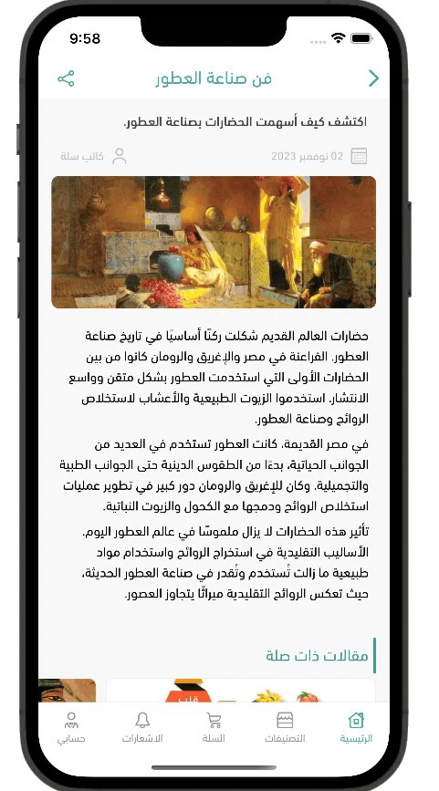
Clicking an article opens:
- Article title in the top bar
- Share button
- Intro text
- Publish date and author
- Full article content
- Related articles section
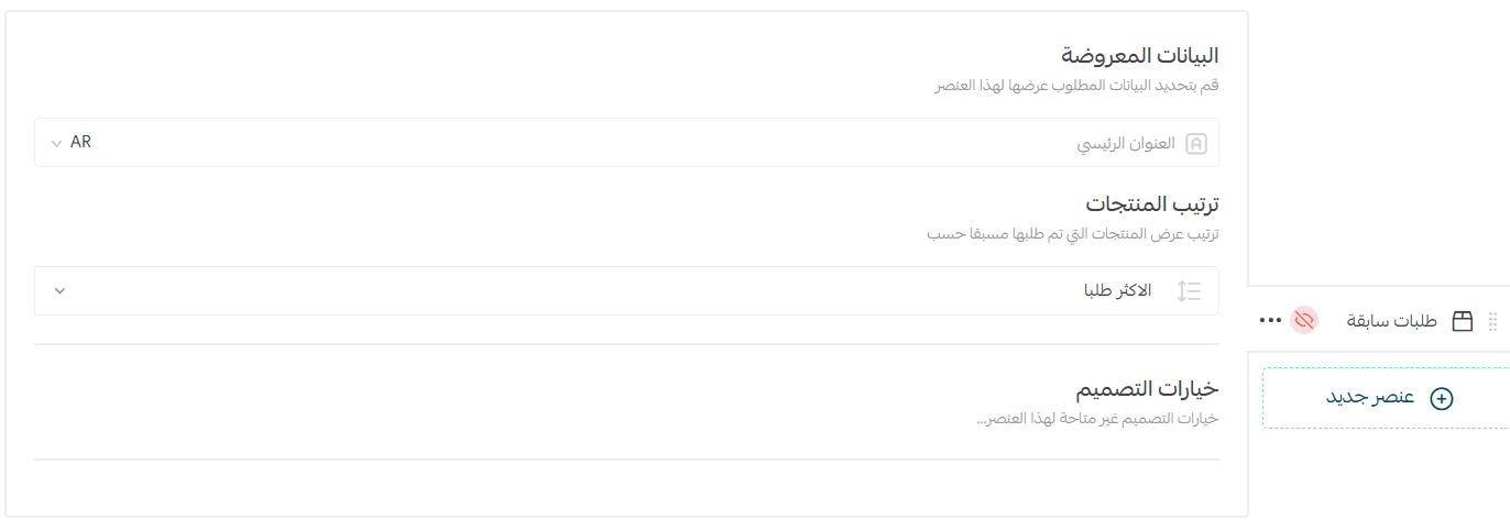
2. Past Orders
This element encourages repeat purchases by displaying products the customer has ordered before.
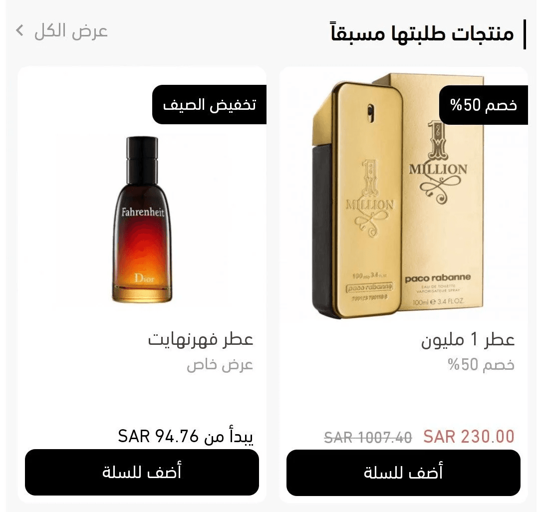
Customization options:
- Section title
- Product source (Most popular or Recent Orders)
Notes:
Displays up to 10 products
Appears only if the user has previous orders
Visible after login
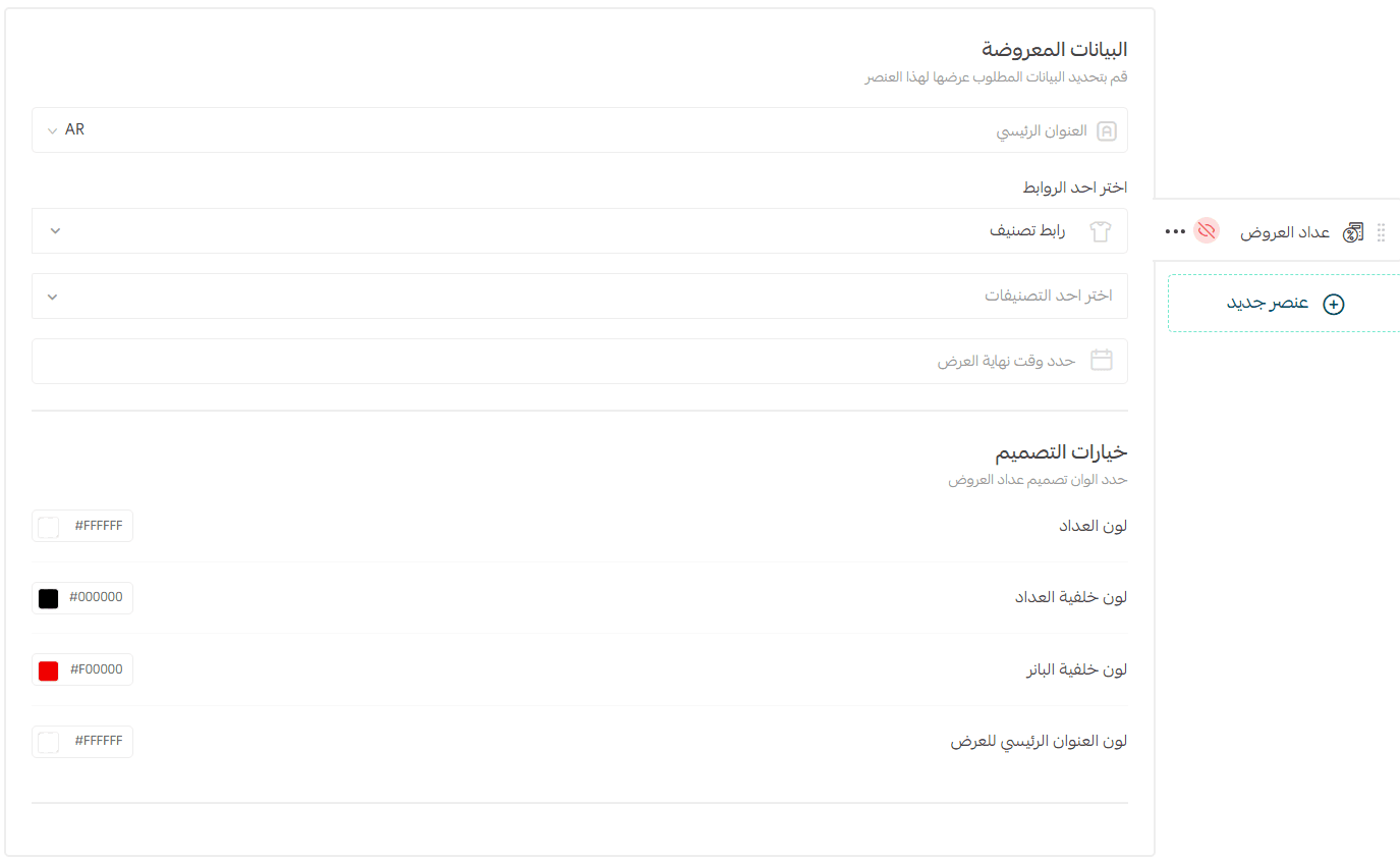
3. Offer Countdown Timer
Use this element to highlight time-limited offers with a live countdown.
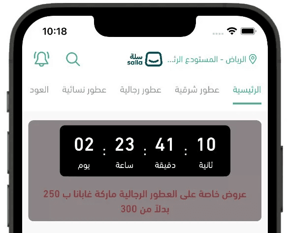
Required fields:
- Main Title: Promotional message
- Link: Product, category, brand, offers page, or custom page
- End Date & Time: Defines when the countdown expires
- Design Options: Colors, background, banner, and text styling
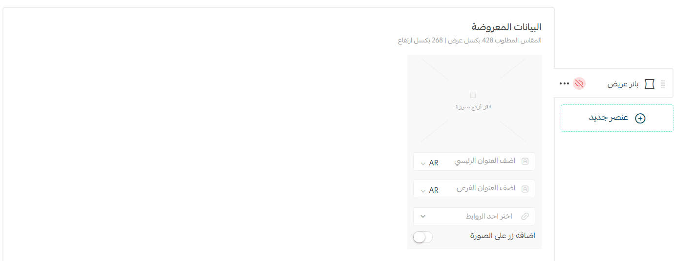
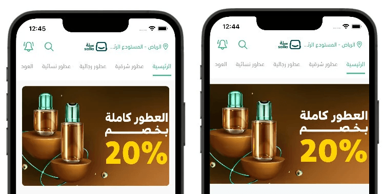
4. Wide Banner
A single image banner displayed on the Home Page.
Recommended size: 428 px (width) × 268 px (height)
Step 1: Content
- Upload image
- Set destination link (product, category, offers, page, brand, or external link)
Step 2: Design
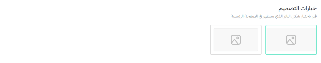
- Customize layout and styling
Step 3: Size
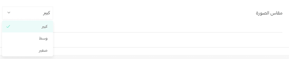
Choose banner size:
- Large
- Medium
- Small

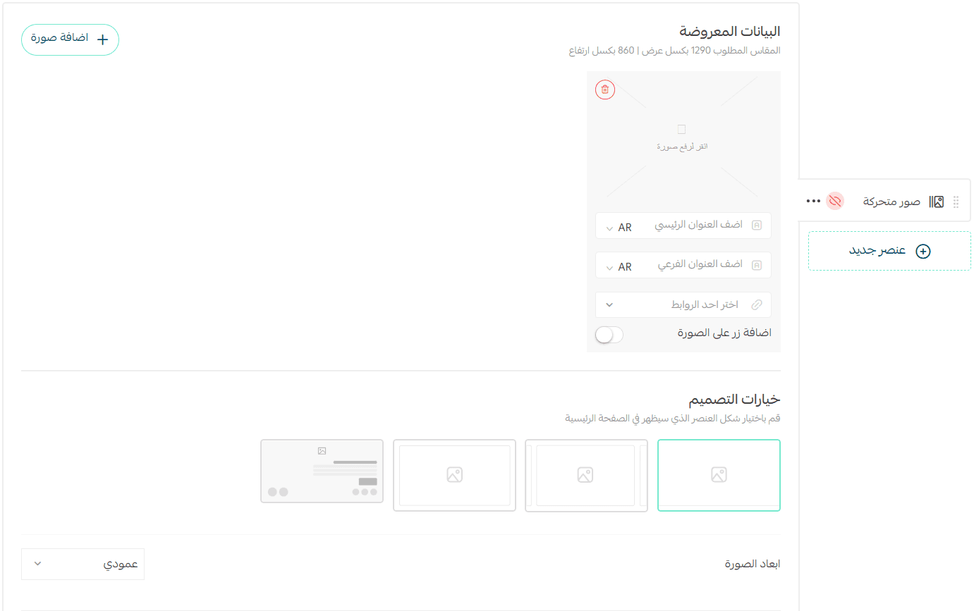
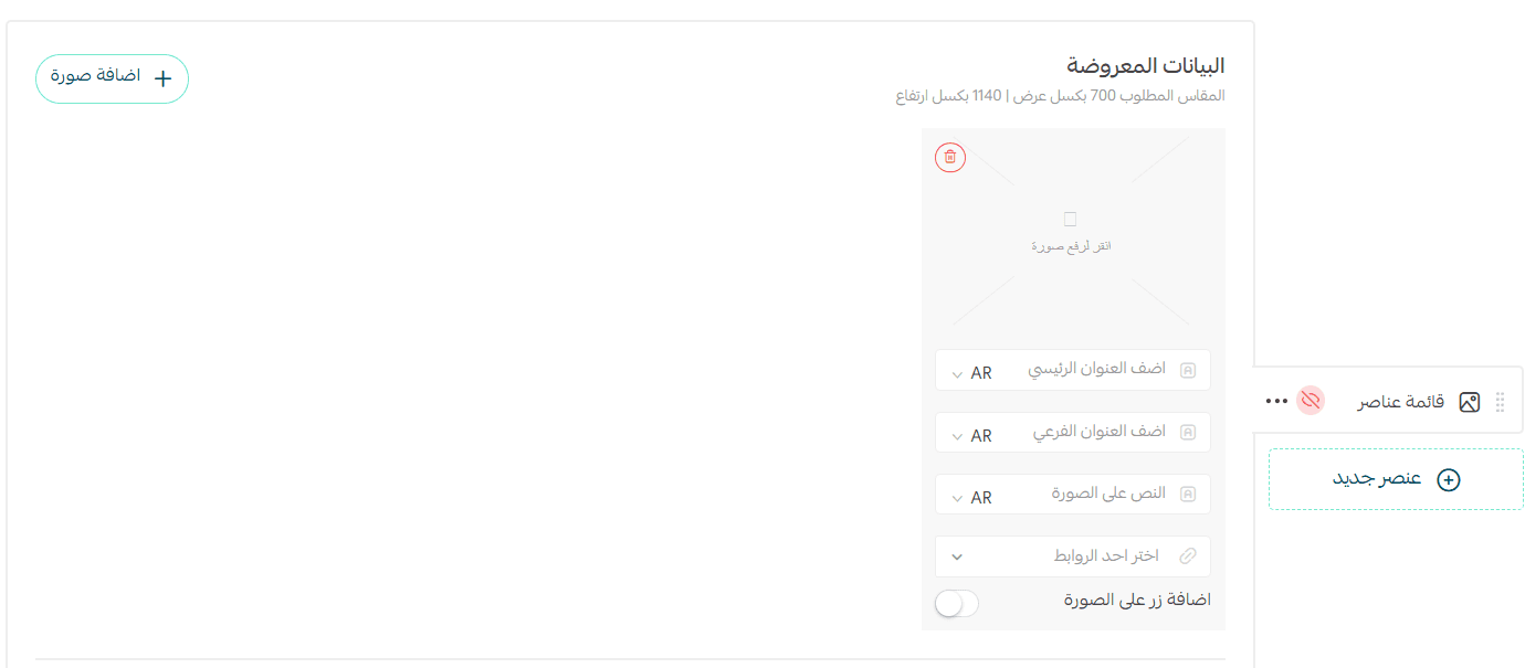
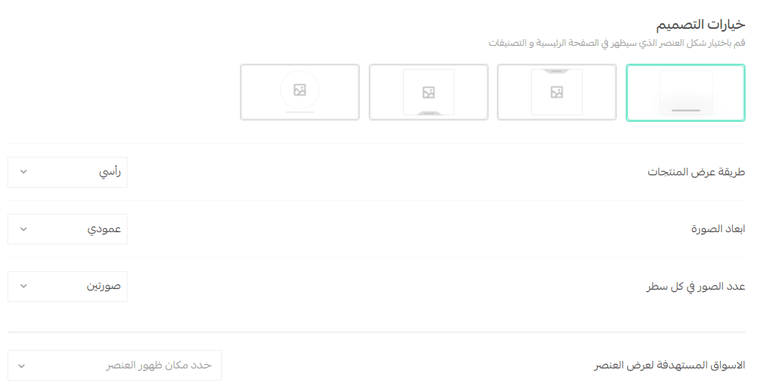
5. Animated Images (Sliders)
Add multiple images with clickable links.
Supported dimensions:
- Vertical (1290 × 860) – default
- Horizontal (1290 × 574)
Each image can link to:
- Product
- Category
- Offers page
- Informational page
- Brand
- External URL
Display styles (horizontal example):
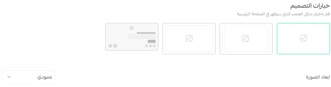
Style 1:
- Large full-width image
- Ideal for visual promotions
Style 2:
- Sliding carousel
- Suitable for multiple offers
Style 3:
- Horizontal grid
- Shows multiple images at once
Style 4:
- Image with text beside it
- Supports scrolling
- Best for explanatory content
⚠️ Note: Change image orientation before uploading new images.
6. Customer Reviews
Configure how customer reviews appear on the Home Page.

Options include:
Display order (Newest, Highest rated, Random)
- Number of reviews
Show or hide customer name
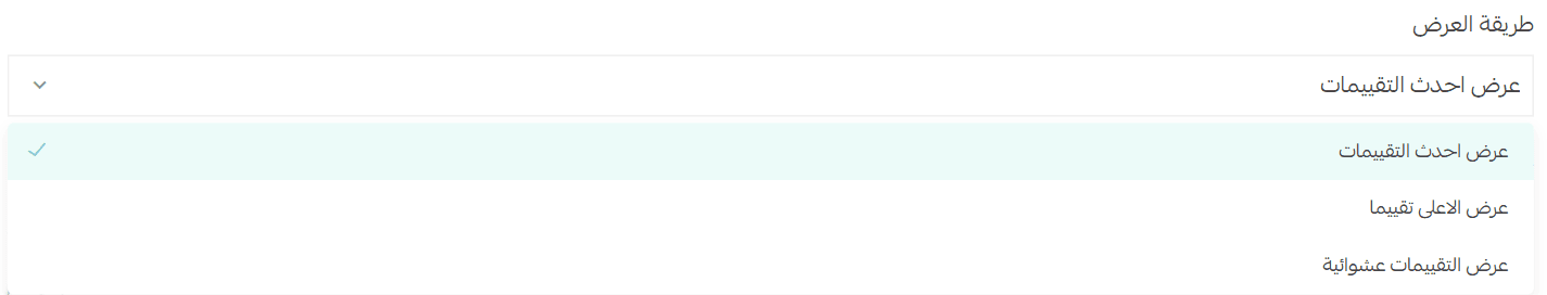
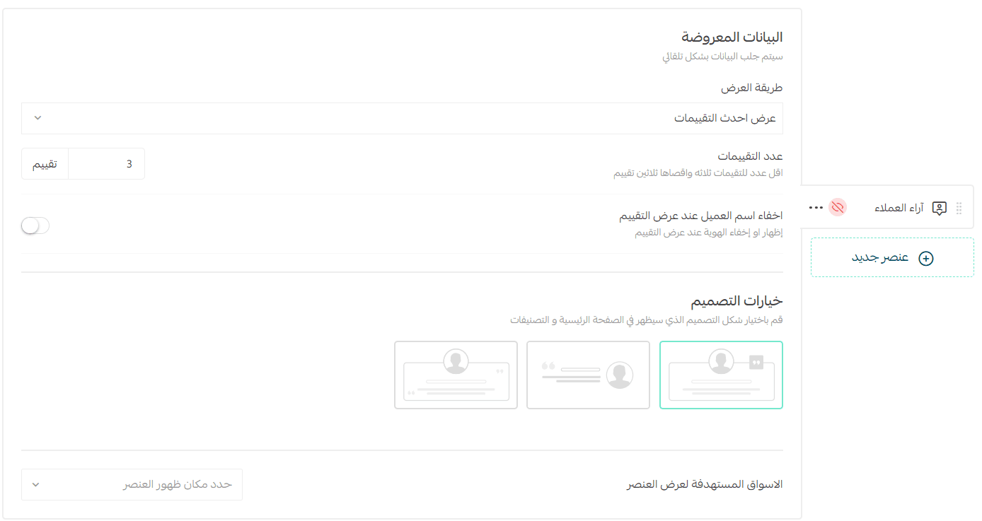
You can also select different design layouts for:
- Home Page
- Categories
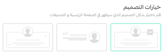
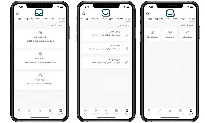
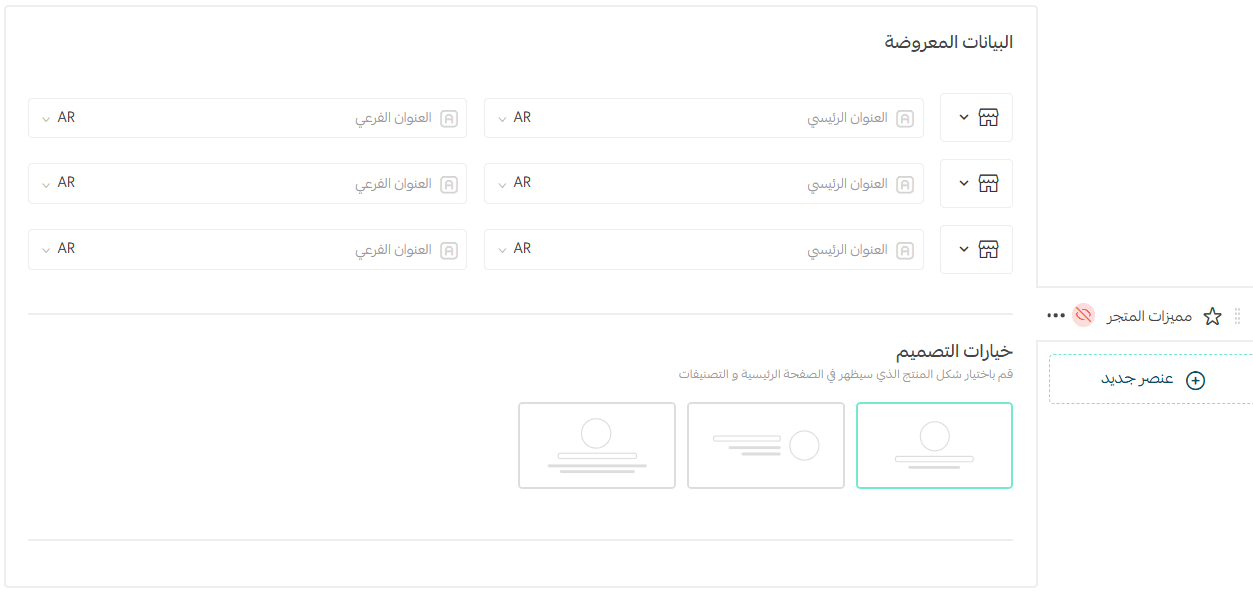
7. Store Features
Highlight key store benefits such as:
- Express delivery
- Secure payments
- Easy returns
Required fields:
- Feature icon
- Main title (short)
- Description (optional)
Layout options:
- Compact (title only)
- List view (aligned by language direction)
- Banner-style with centered text
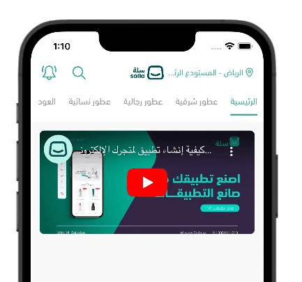
8. YouTube Video
Embed a YouTube video by pasting the video URL into the designated field.
The video will appear directly within the app.
9. Item List
Display images as a clickable list.
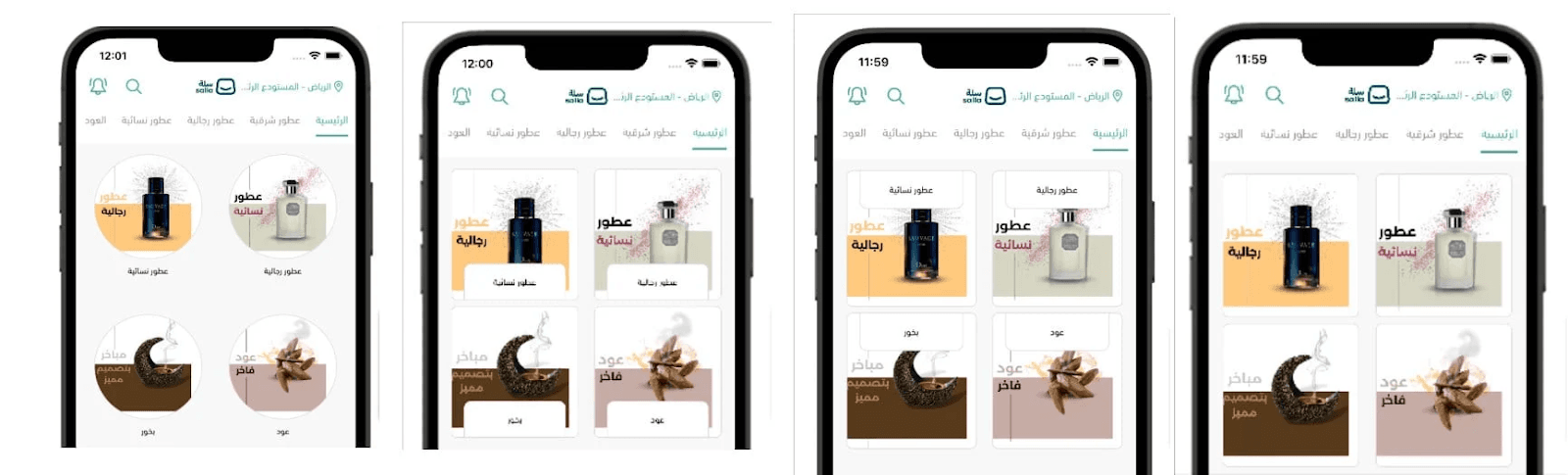
Step 1: Content
- Upload image
- Optional overlay text
- Destination link (product, category, brand, offers, page, or external)
Step 2: Design
Choose layout style and text position
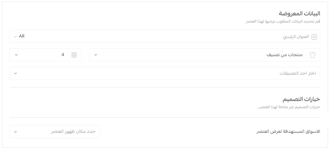
10. Fixed Products
Displays products in a grid layout.
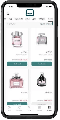
Options:
- Section title
- Product source (Category, Best Sellers, Latest, Random)
- Number of products displayed
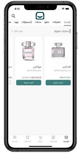
11. Scrolling Products
Products appear in a horizontal scroll bar.
You can display:
- Category products
- Best sellers
- Latest products
- Selected products
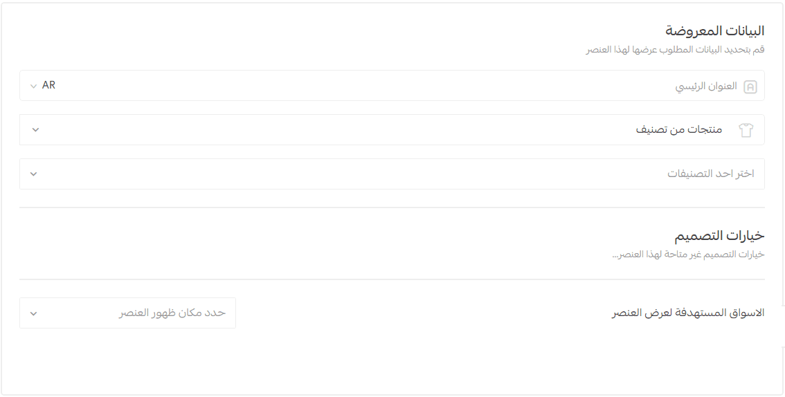
🔹 This element uses a fixed design (no styling options).
Customers can:
- Swipe horizontally
- Tap View All to see the full list
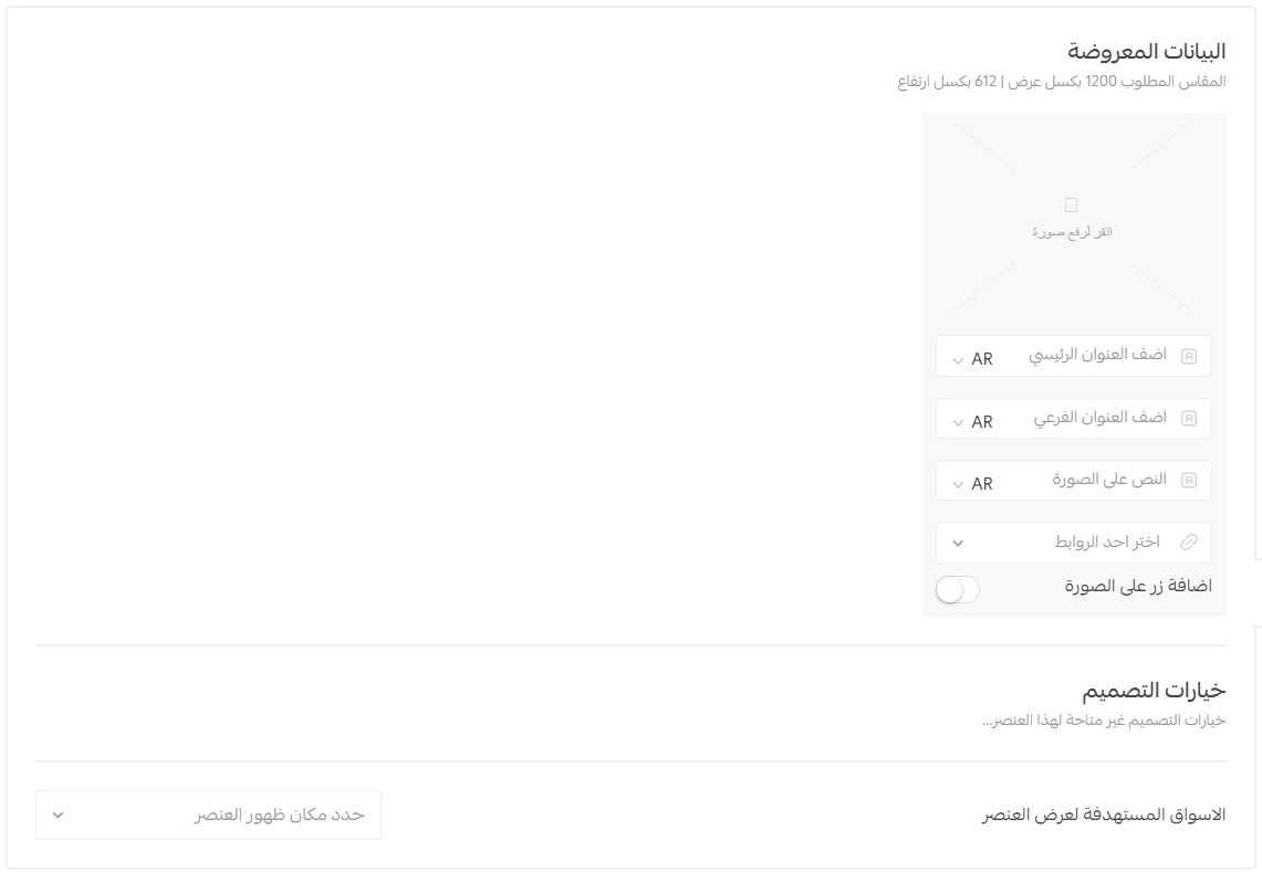
12. Store Background
A background image with overlay text and an action button.
Recommended size: 1200 × 612 px
You can link it to:
- Product
- Category
- Offer
- Informational page
- Brand
- External URL
Frequently Asked Questions
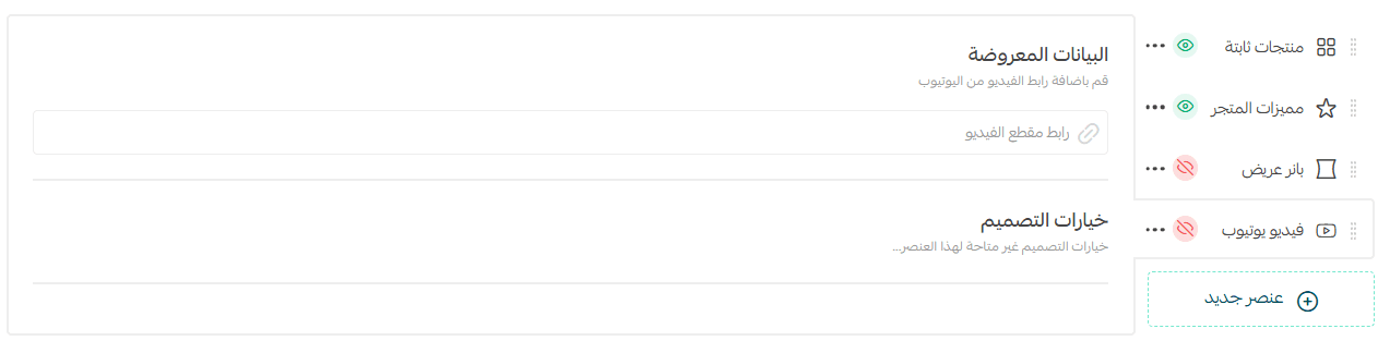
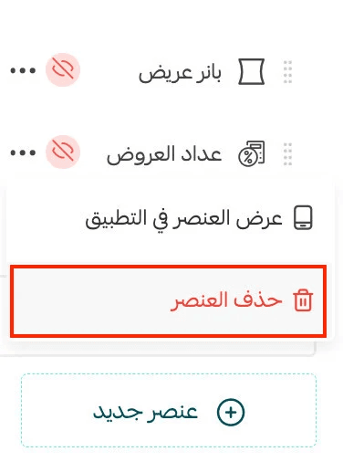
How do I delete an element?
Click the More (⋯) icon next to the element, then select Delete Element.
Can I show or hide elements?
Yes. Click More (⋯), then choose:

- Show in App
- Hide in App
🔹 This applies to all elements (Home Page, Categories, Onboarding).
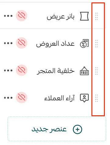
How do I reorder Home Page elements?
Simply drag and drop elements to change their order.
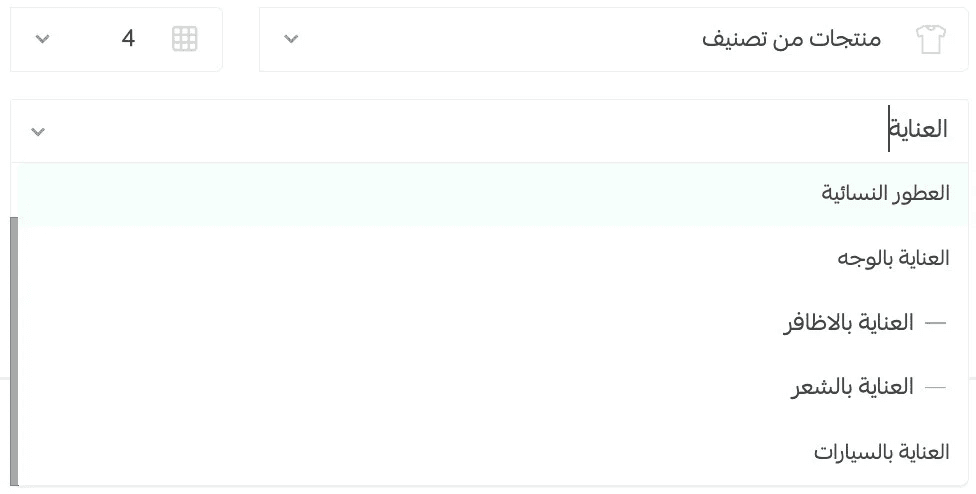
How do I search for products, categories, or brands when linking elements?
Use Quick Search, available across all App Maker elements.
What happens if I don’t add any Home Page elements?
The Home Page will appear empty in the app.
It’s recommended to add at least one element, such as Fixed Products linked to Latest Products.
Can I hide the Home Page tab entirely?
Yes. See: App Design Using the Default Template – Top Bar & Tabs