Many users open an app for the first time without knowing where to start or how to find what they need. Intro screens solve this by guiding users step by step, simplifying the first experience, and helping them connect with your app from the very first interaction.
When designed well, intro screens reduce confusion, increase engagement, and set the tone for a smooth user journey.
📌 Article overview
- Steps to design intro screens using the default template
- Splash Screen
- Onboarding Screens
Steps to design intro screens using the default template
1. Access the App Maker
From the main menu, click Store & channels, then select Mobile App.
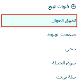
2. Open Intro Screens Settings
From the app design section, select the (Intro Screens) tab.
3. Configure Intro Screens Based on Your Store Needs
Intro screens are divided into two types: Splash Screen and Onboarding Screens.
Below is the difference between them and how each one is used.
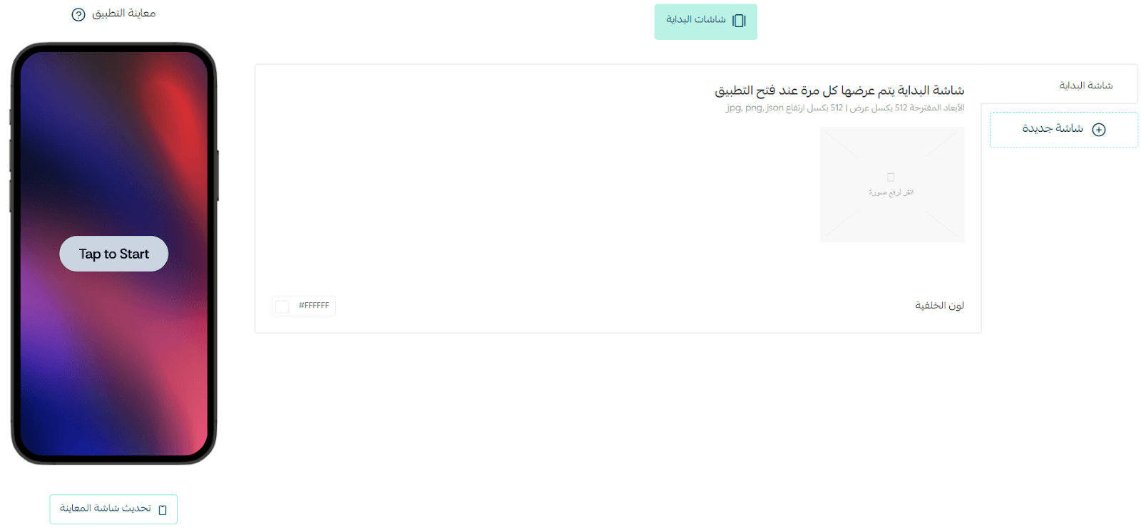
Splash Screen
The Splash Screen appears briefly every time the app is opened.
Key characteristics:
- Displays for a short duration (3–6 seconds)
- Creates a strong first impression before entering the app
- Usually includes your store logo or app name with a clean background
- Allows time for initial loading and setup
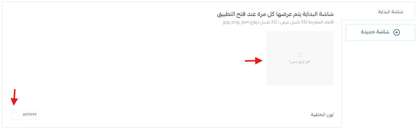
Customization Options
- Choose a background color that matches your brand identity
- Upload an image sized 512 × 512 px (such as your store logo)
- Use a clean white background or brand-aligned colors
- Add motion for extra impact by uploading an animated JSON file
👉 For more details, see: Animated Images (Motion) Support in the App Maker
Onboarding Screens
Onboarding Screens appear only once, when the user opens the app for the first time after installation.
Their purpose is to guide new users, explain the app’s value, and help them understand how to get started quickly.
Key Uses
- Guide users through the app’s core experience
- Explain features and services in a simple, friendly way
- Display content as swipeable slides for easy navigation
- Highlight key features in a clear and engaging format
Customization Options
- Add up to 6 onboarding screens
- Each screen can present unique visual content or instructions
- Users can skip onboarding and enter the app directly
✨ These screens are a crucial part of the first-time user experience, ensuring a smooth start and building confidence from the very beginning.
4. Add and Manage Onboarding Screens
To customize onboarding screens, click (New Screen).
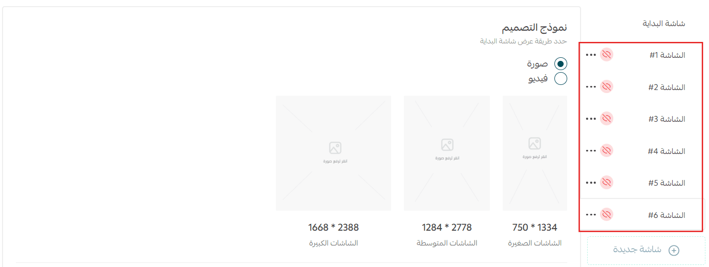
- You can add up to 6 screens
- Delete any screen using the delete icon next to its number
- Show or hide screens as needed
5. Upload Images for Each Screen
Upload images that work across all screen sizes.
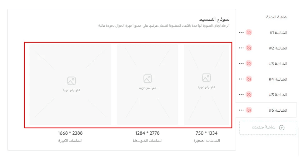
📌 For each screen, the same image is uploaded in different resolutions to ensure optimal display on all devices.
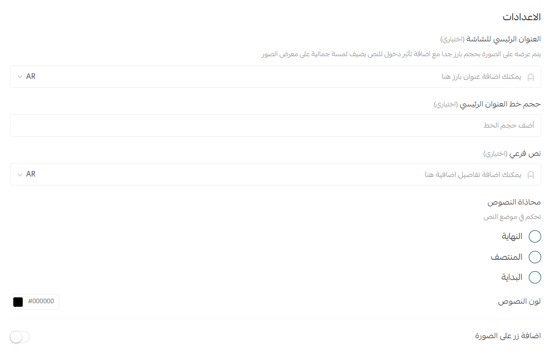
6. Configure Screen Settings
Each intro screen supports the following settings:
Main Title (Optional)
The primary text displayed prominently on the image.
Use a short, attention-grabbing phrase or headline.
Main Title Font Size (Optional)
Control the size of the main title text to match your design and brand style.
Subtitle (Optional)
A secondary text area below the main title for additional context or messaging.
Examples:
- Discover our latest collection
- Exclusive offers all week
Text Alignment
Choose where the text appears on the screen:
- Bottom
- Top
- Center
Text Color
Select a text color (white, black, or HEX code) that contrasts clearly with the background for readability.
Button on Image (Optional)
Enable a call-to-action button that appears on top of the image.
- Helps users move directly to a key action (e.g., Start Now, Shop Now)
- Controlled using the toggle switch in the settings panel
Notes & Testing Tips
- To test the Splash Screen, close the app and reopen it.
- To test Onboarding Screens, delete the app and reinstall it from the app store.