The product card is the first thing a shopper looks at in your app. Is yours showing them a reason to buy?
You can now shape every detail of the product card in your store's app so it matches your brand: the layout, the price before and after a discount, the discount badge, ratings, custom fields, and a quick add button that lets customers set a quantity without leaving the page. The result is a smoother, more tempting shopping experience. In this guide, you'll learn how to customize the product card setting by setting.
The product card settings live in your mobile app's default theme. Open (Store and sales channels), click (Mobile app), click (Customize) next to the default theme, open (General settings), then choose (Product card). Every option there applies to the home page, categories, and suggested products.
📌 Article overview
- How to open the product card settings
- Card design, prices and discounts
- Ratings, sub-categories and custom fields
- Frames, quick add and image display
- Frequently asked questions
👣 How to open the product card settings
1. From the main menu, click (Store and sales channels), then (Mobile app).

2. Next to the default theme, click (Customize).
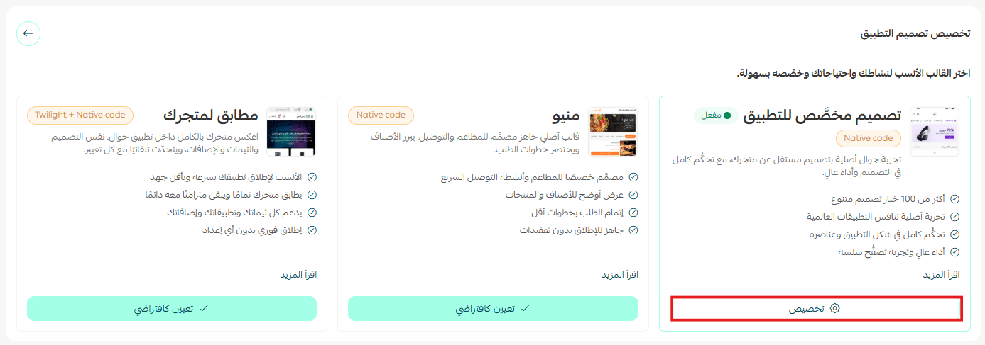
3. In the app design, choose the (General settings) section.
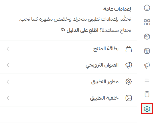
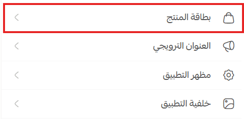
4. Choose (Product card) to set how it is laid out on the home page, in categories, and in suggested products, so it fits your store's identity.
🚀 Card design, prices and discounts
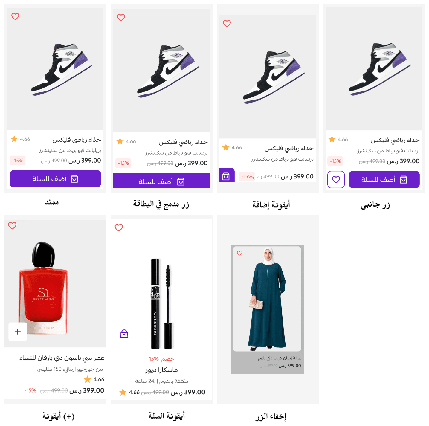
Product display design
Choose a design that suits your products and your store's identity.
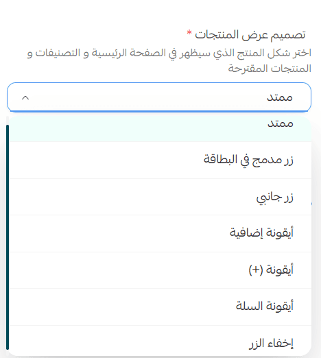
Here is how each design looks:
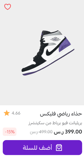
Show the price before and after the discount
Show the original price next to the discounted price, so the value of your discounts stands out and encourages customers to buy.

In your store, it appears like this:
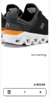
Add to cart with quantity controls
A (+) and (-) control appears inside the product card, so customers can add the product and set the quantity they want straight away without opening the product page. An alert appears when they reach the maximum quantity available in stock.

In your store, it appears like this:
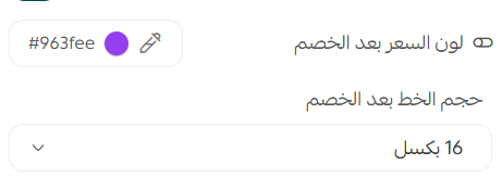
Color and size of the discounted price
Set the color and font size of the price after the discount, so the current price stands out in your store's style.
In your store, it appears like this:
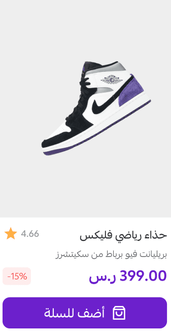
Show the discount percentage
Display the discount percentage on the product card to catch the customer's eye.

In your store, it appears like this:
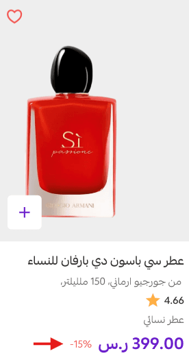
🎯 Ratings, sub-categories and custom fields
Show ratings on the card
Display customer ratings on the product card to support the buying decision.

In your store, it appears like this:
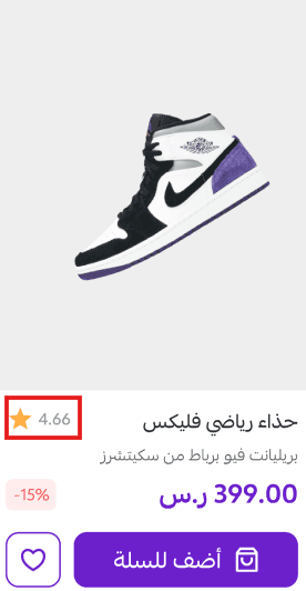
Show the sub-category
Display the product's sub-category so its type or class is immediately clear.

In your store, it appears like this:
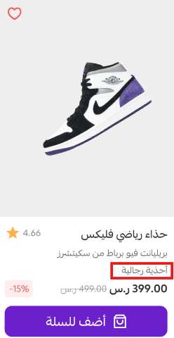
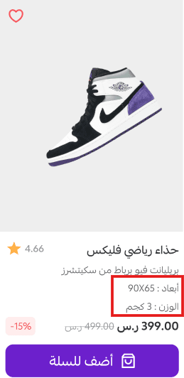
Show custom fields
Display the custom fields you added to your products on the card, so important information is easy to spot.

In your store, it appears like this:
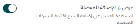
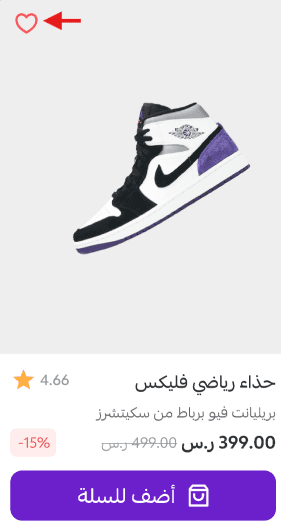
Show the add to favorites button
Display the button that adds a product to favorites, so customers can save products and come back to them later.
In your store, it appears like this:
✅ Frames, quick add and image display
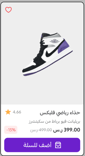
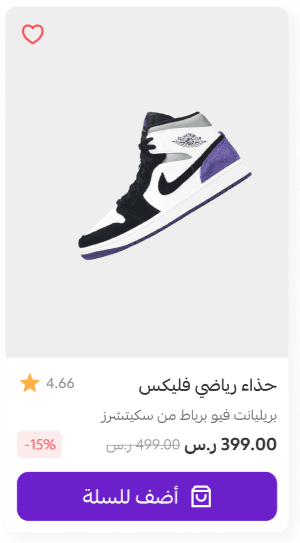
Card frame style
Choose a frame or shadow style for the product card, or show it with no frame at all, to match your store's identity.
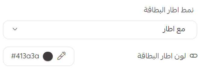
- The product card with a black frame
- The product card with a gray shadow
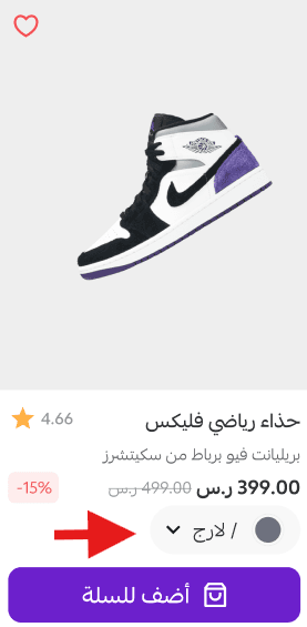
Show product options in quick add
Let customers pick options such as color or size directly from the quick add window, which cuts the number of steps to a purchase.

In your store, it appears like this:
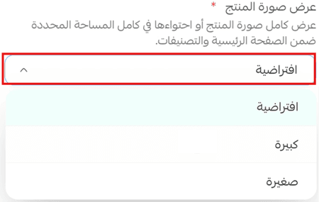
Product image display
Control how the product image is displayed inside the card, in a way that suits your store's identity.
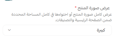
- How product images are displayed:
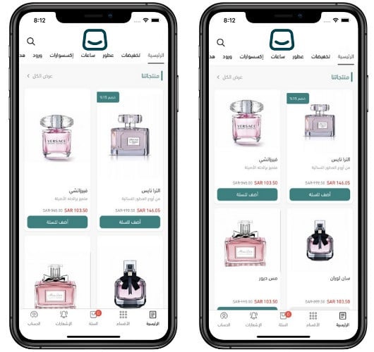
Here is the difference between the two options. In the image below, the card on the right uses the default product image display, and the card on the left shows it enlarged:
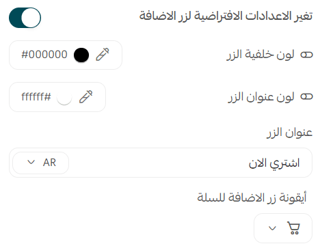
Change the default settings for the add button
Set the behavior and look of the add button so it matches your store's identity.
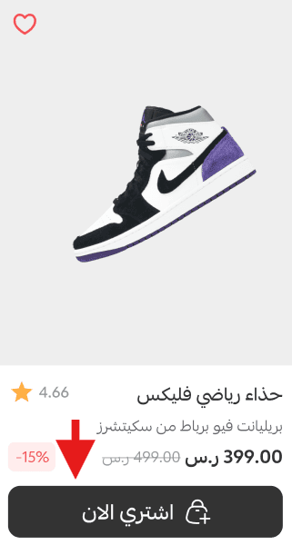
In your store, it appears like this:
📝 Important notes
The product card settings apply everywhere the card appears: the home page, category pages, and suggested products.
Turning on every option at once crowds a small card. Show the details that help someone decide, and leave the rest for the product page.
❓ Frequently asked questions
Where do I find the product card settings?
From the main menu, click (Store and sales channels), then (Mobile app), then (Customize) next to the default theme. Open (General settings) and choose (Product card).
Do these settings apply to the whole app?
They apply wherever the product card is shown: the home page, categories, and suggested products.
Can customers set a quantity without opening the product page?
Yes. With add to cart quantity controls turned on, the (+) and (-) controls appear on the card itself, and an alert shows when the customer reaches the maximum quantity in stock.
Can customers choose a color or size without leaving the list?
Yes, if you turn on showing product options in quick add. Options such as color and size can then be chosen inside the quick add window.
How do I make discounts more visible?
Turn on showing the price before and after the discount, turn on the discount percentage, and set a color and font size for the discounted price so it stands out.
Treat the product card as a small piece of merchandising. Every option here either helps a customer decide or gets in the way, so choose the handful that make your products easier to buy.