Want a storefront that looks deliberately different from standard theme layouts?
The Mukhtalif Theme combines exclusive components, creative layouts, visual guidance inside the editor, and redesigned homepage and product-page experiences. In this guide, you'll learn how to install Mukhtalif, add its enhanced components, configure the header and footer, and understand its product and listing-page layouts.
To use the Mukhtalif Theme, open Store Design, search for Mukhtalif, purchase it, and complete payment. Customize the installed theme from Store Design and preview your changes before activation. Add theme-specific homepage components from Homepage elements, then configure each component's images, text, colors, overlays, direction, and alignment.
📌 Article overview
- How to install and customize the Mukhtalif Theme
- Visual guidance inside theme components
- Exclusive and enhanced homepage components
- Header, footer, product, and listing-page features
- Frequently asked questions
🚀 How to install the Mukhtalif Theme
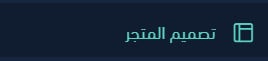
1. From the dashboard side menu, click (Store Design).
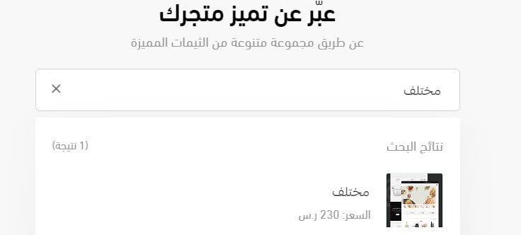
2. On the Store Design page, search for Mukhtalif, then click (Mukhtalif) in the results.
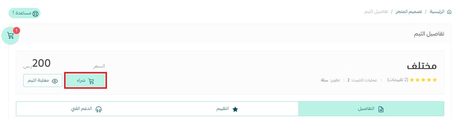
3. On the theme details page, click (Purchase), then complete payment.
After installation, return to Store Design and customize the theme.
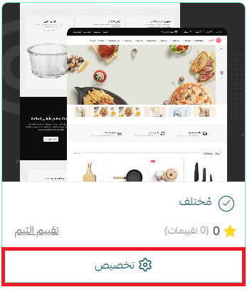
Preview your store from the theme customization page before applying your changes.
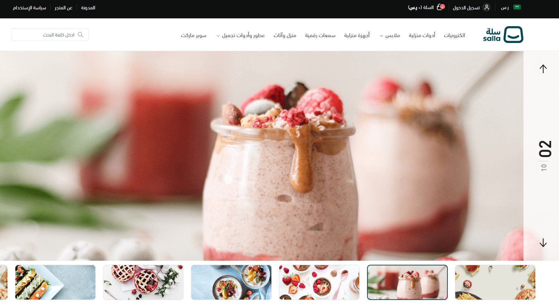
You can also preview a store using the Mukhtalif Theme.
For more details, see managing the Theme Store and Store Design and customizing your store design.
❓ Frequently asked questions about the Mukhtalif Theme
What does visual guidance inside theme components mean?
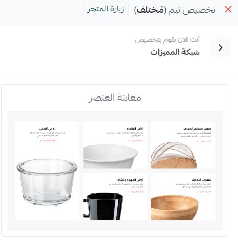
When you select a component in Store Design, an illustration appears to explain its function and help you visualize the result before customizing it.
Which exclusive or enhanced components does Mukhtalif include?
The source introduces enhanced animated images, two feature-gallery designs, a feature grid, enhanced and vertical product galleries, an enhanced wide banner, a redesigned blog, quick links, and brands. [Verify: the overview lists eight components, while the detailed section contains ten numbered components.]
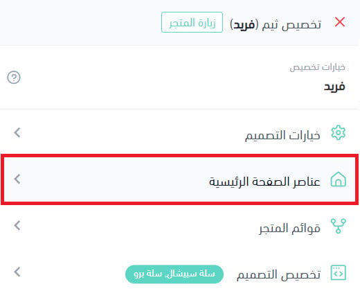
To add them, open the Mukhtalif customization page and click (Homepage elements).
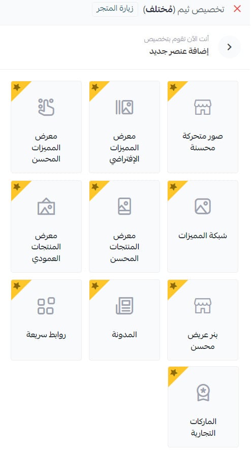
Click (Add new element).

Theme-specific or enhanced components are marked with a star.
1. Enhanced feature gallery
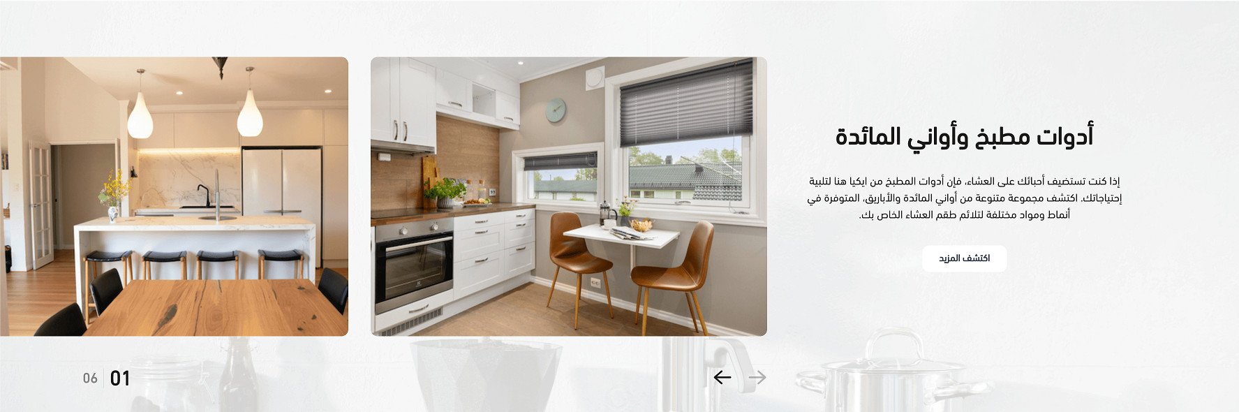
The first layout shows feature images horizontally beside a fixed text area. You can reverse the direction and move the text area to the opposite side.
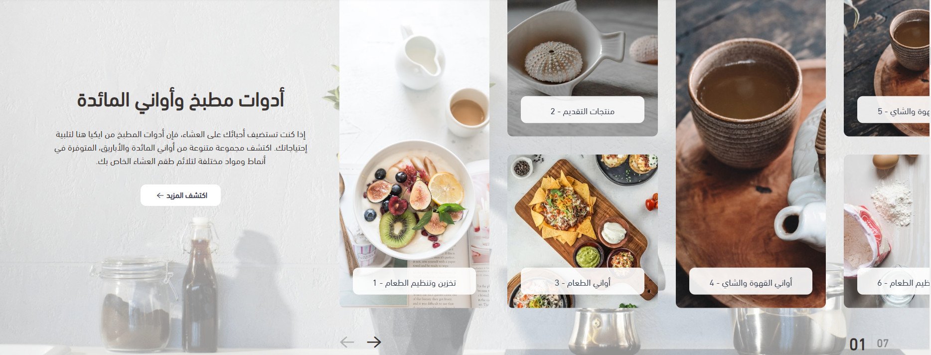
The second layout shows the feature images in a grid with the same options.
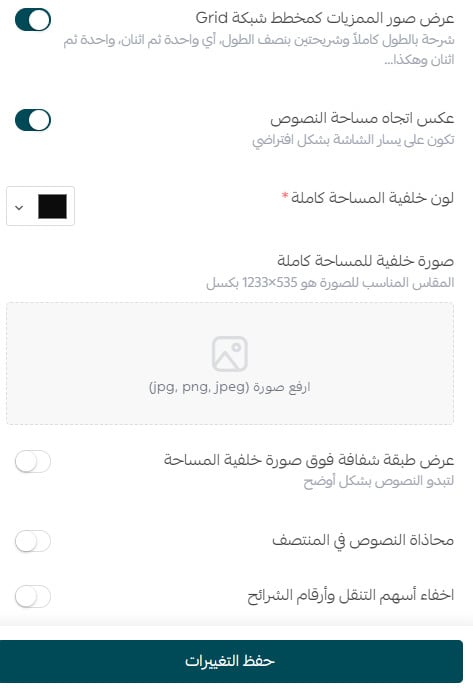
Use the component settings to configure the chosen layout.
2. Default feature gallery
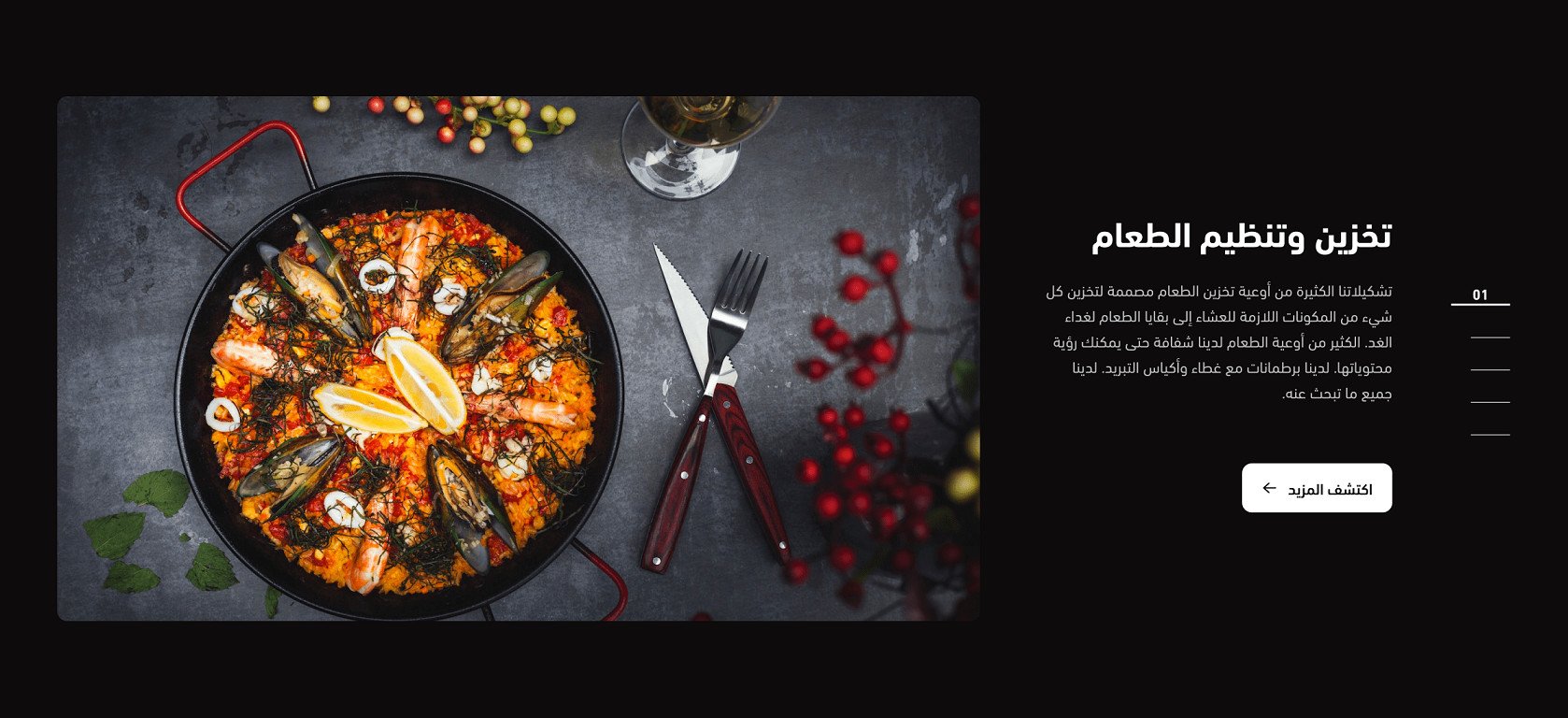
The default feature gallery uses a vertical navigation design with slide numbers.
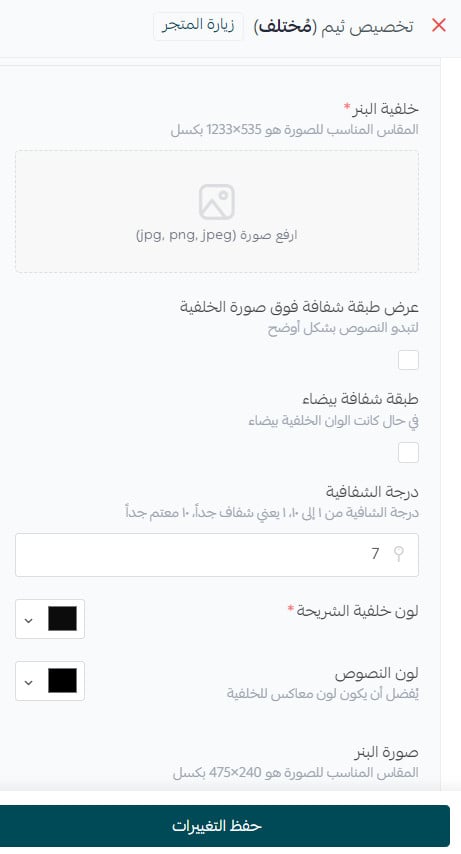
You can add a transparent white layer over the background image, control its opacity, and use the other available customization settings.
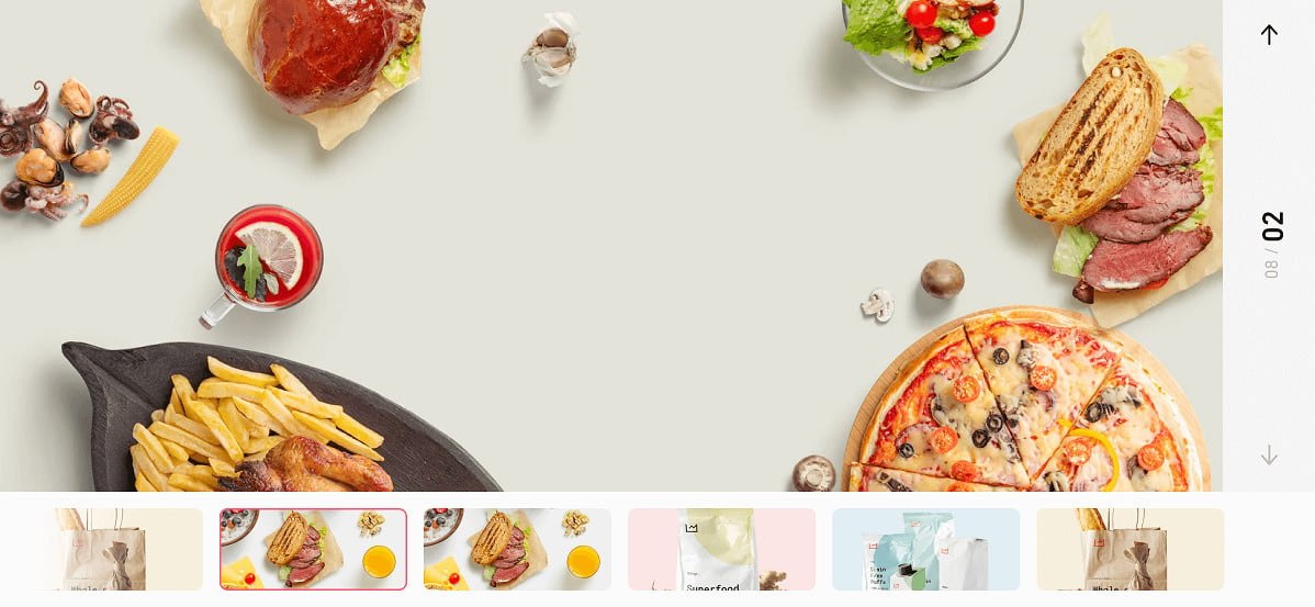
3. Enhanced animated images
The enhanced animated-image component uses vertical navigation between slides.
4. Vertical product gallery
The products appear vertically rather than horizontally, with a fixed text area beside the gallery.
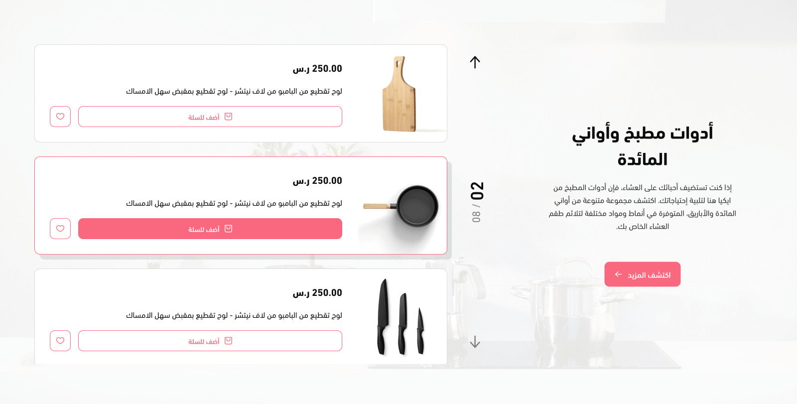
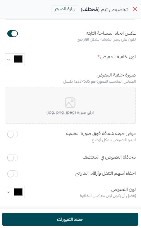
Options include reversing the fixed area's direction, displaying an overlay on the background image, and centering the text.
5. Enhanced product gallery
A text area appears beside the gallery.
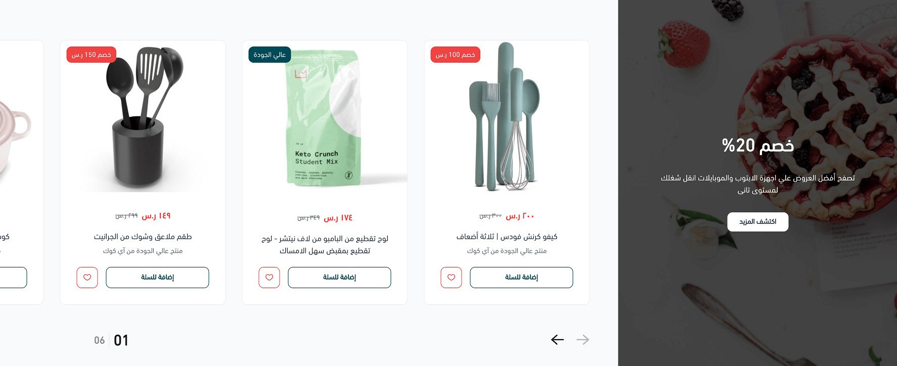
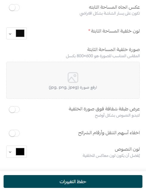
Control the background image, text colors, and background overlay to keep the text readable.
6. Feature grid
Display store features and products in a grid layout.
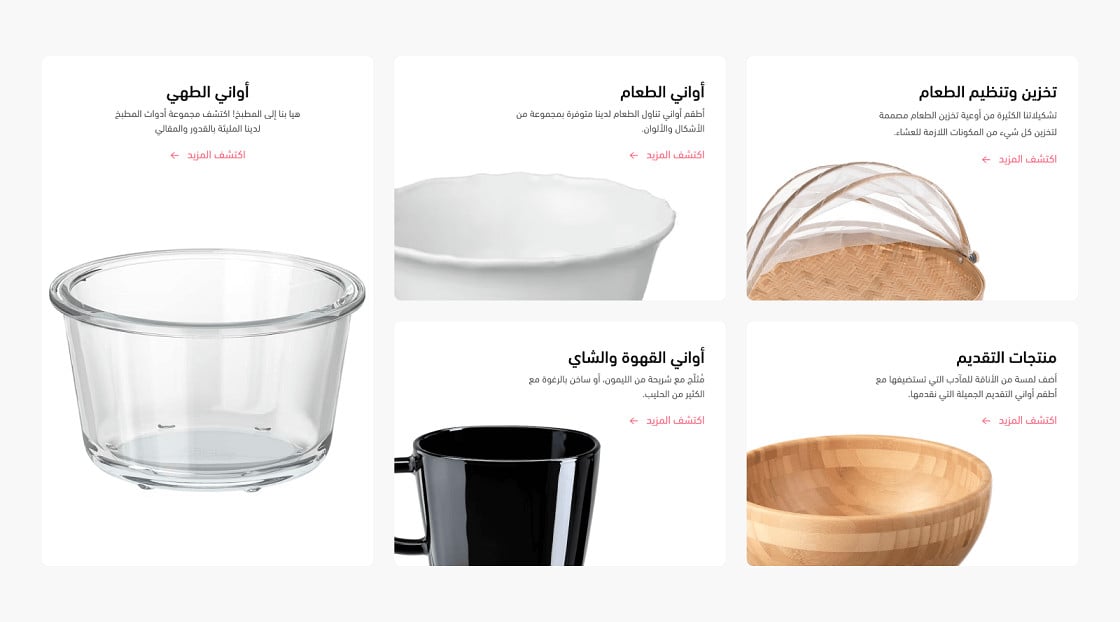
Advanced customization options include text alignment.
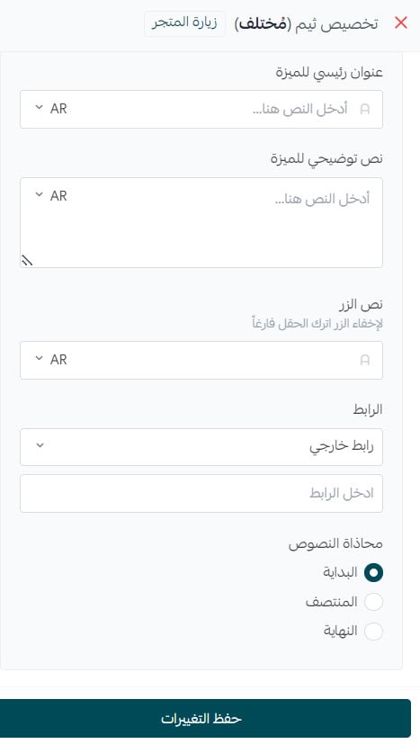
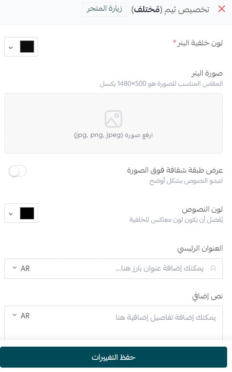
7. Enhanced wide banner
The enhanced banner appears as shown.
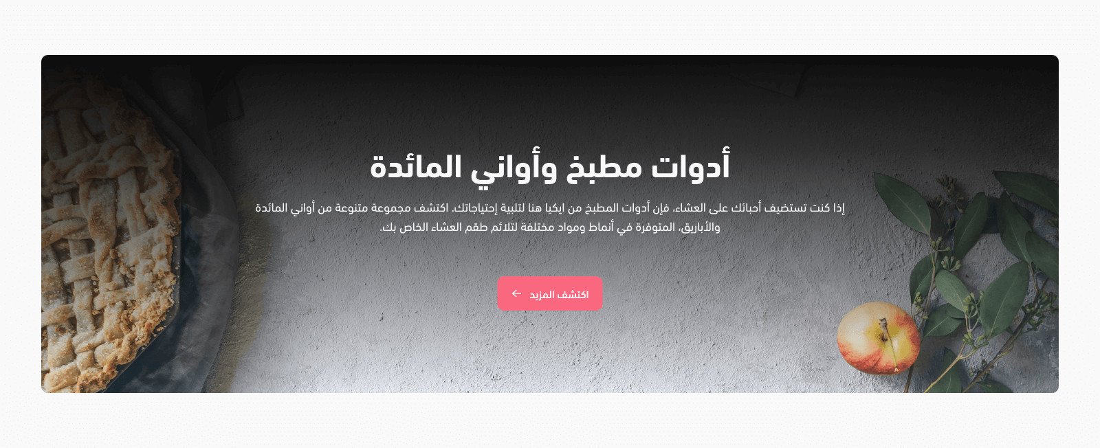
Control the banner background, text colors, and overlay.
8. Blog
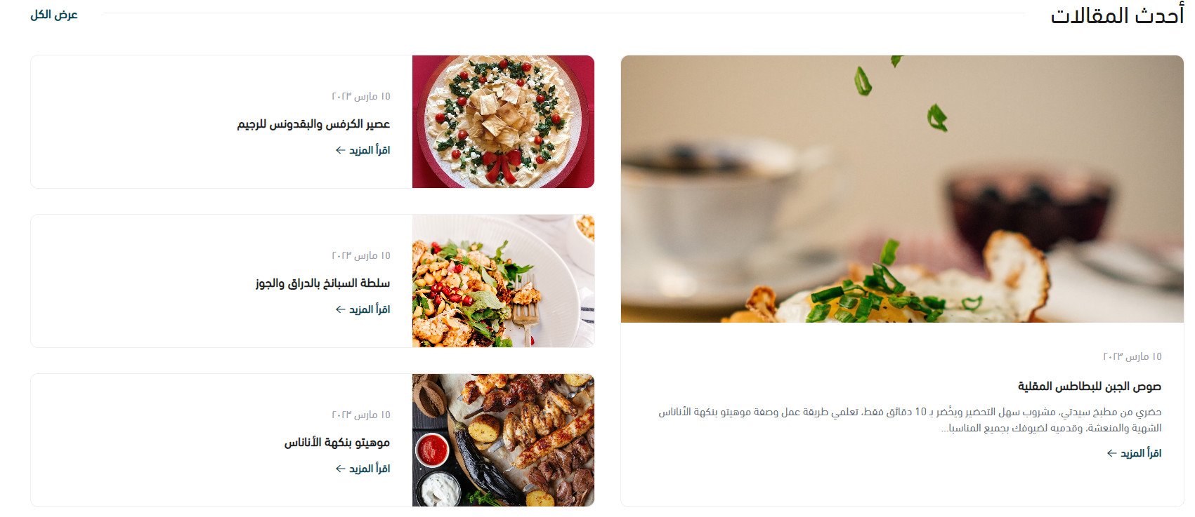
The blog uses a design tailored to the Mukhtalif visual style.
9. Quick links
The quick-links component follows the Mukhtalif layout shown here.

10. Brands
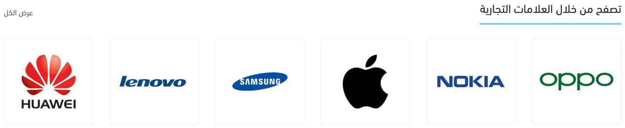
The brands component is adapted to the Mukhtalif Theme's overall visual style.
What header and footer features does Mukhtalif provide?
Header features

1. The top bar contains contact information, important links, currency and language switchers, a branch switcher, and sign-in.
2. The main navigation bar contains the store logo, main menu, and search bar.
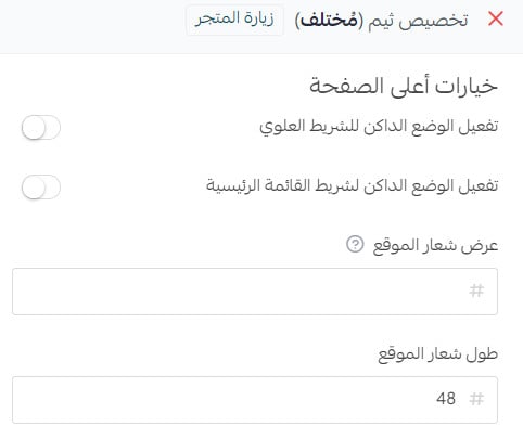
You can choose a light or dark color mode for each bar. Set the logo width and height in pixels, or enter one dimension and let the other scale proportionally.
Footer features
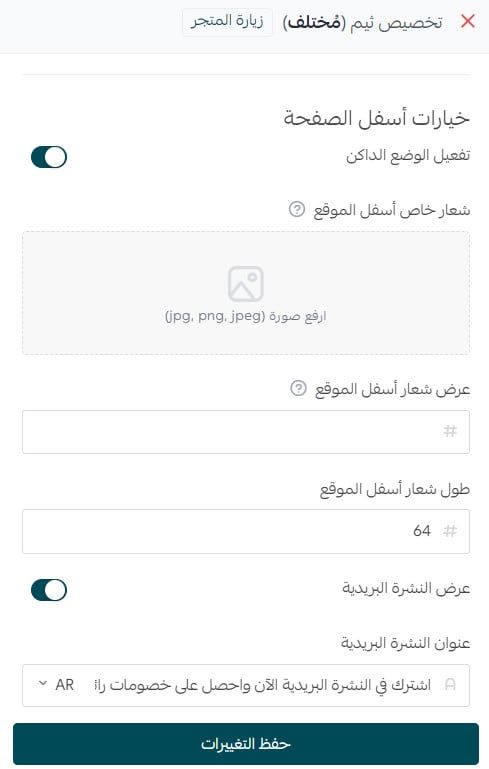
The footer contains a newsletter bar and social links.
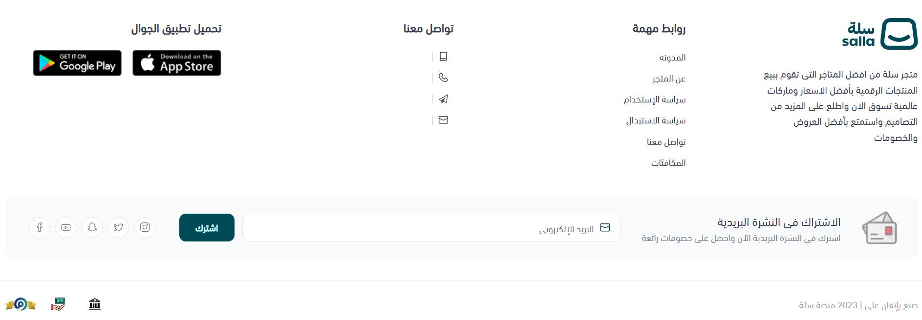
Its main area can show the store description, important links, user links, app-download icons, and a full-width map beneath the footer content. The complete footer supports light and dark modes, along with custom logo dimensions.
Does Mukhtalif change product pages or product listings?
Product page
The top of the product page uses two or three columns depending on whether the product has options:
1. Product image gallery.
2. Product details and description.
3. Product options, when available.
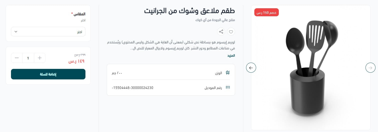
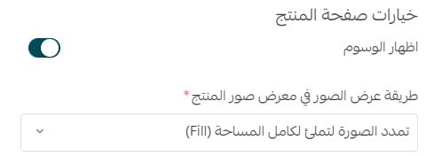
When no options exist, the page uses two columns. You can control how images appear in the gallery, while retaining the standard product-page features.
Product listing pages
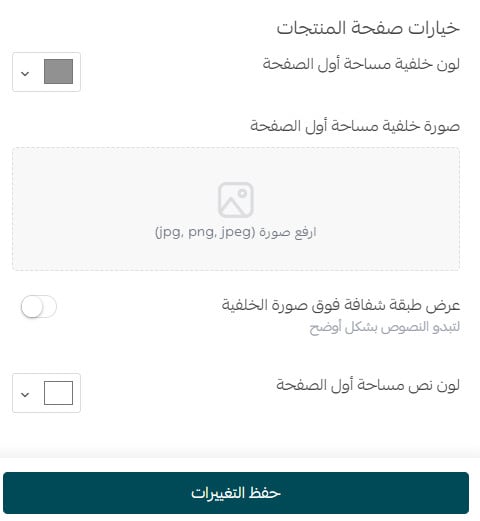
Category, tag, discount, and other listing pages can use a custom background for the top section, plus separate background and text colors.
Other store pages
The remaining store pages use a redesigned layout intended to match the overall Mukhtalif visual style.
📝 Important notes
The source's component overview contains eight items, while its detailed numbered list contains ten. Confirm which list represents the current theme before publication.
Preview every layout at desktop and mobile sizes, confirm text contrast over background images, and test product options before applying the theme.