When a shopper scrolls past hundreds of apps, will yours be the one their eye stops on?
Your app icon is the first thing users see when they find your store's app in the App Store or Google Play, and it stays on their home screen every day after that. Choosing the right icon means meeting the app stores' technical requirements while designing something distinctive enough to represent your brand. In this guide, you'll learn what makes a good app icon, the criteria app stores enforce, design best practices, and how to upload your icon through App Maker.
An app icon is a small visual symbol that represents your app on smart devices and in app stores. To choose one on Salla, prepare a 1024 x 1024 pixel PNG with a non-transparent background and a full-square shape, then upload it from the first page of App Maker's app details steps.
📌 Article overview
- What is an app icon?
- Why your app icon matters
- App store criteria for icons
- Best practices when designing your icon
- How to choose the icon through App Maker
- Frequently asked questions
🎯 What is an app icon?
An app icon is a small visual symbol used to represent a specific app on smart devices and in app stores. It usually sits on the phone or tablet's home screen, and it also appears in app stores when users search for the app or browse listings.
Why your app icon matters
The app icon is one of your app's most important marketing assets — it is the first thing users see when they search for your app in the app store. That makes it essential to choose a distinctive, attractive icon that catches the eye and accurately reflects what your app is and does.
The icon's job is to identify your app quickly and set it apart from every other app. A good icon is unique, sticks in the memory, and conveys the app's purpose and character effectively, so users can recognize it quickly and easily.
✅ App store criteria for icons
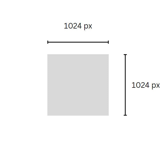
1. Use the required dimensions: 1024 pixels high by 1024 pixels wide.
2. Save the icon in PNG format.
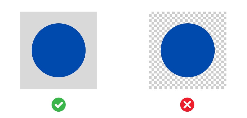
3. Use a non-transparent background layer.
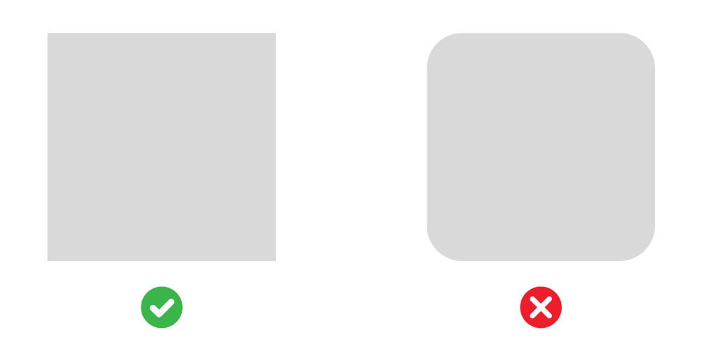
4. The icon must be a full square with sharp corners — the app stores crop the square and round the edges automatically.
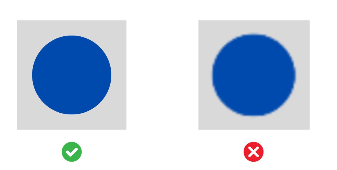
5. Use a high-resolution image so the icon stays crisp and does not look blurry when enlarged.
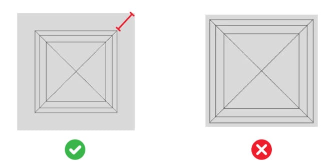
6. Leave a margin (empty space) of at least 20% from the edges, with the design centered in the icon. This prevents part of the design from being cut off when the app stores round the corners automatically.
7. Make sure the icon you use does not belong to a known brand and is not already reserved in the app stores — such as the Apple or Google icons.
8. Keep the design clear with well-contrasted colors; avoid washed-out designs or colors that are too similar to each other.
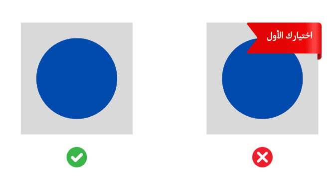
9. Do not include promotional phrases in the app icon, such as "best app," "best prices," "best choice," or "the number one app in the Kingdom."
💡 Best practices when designing your icon
- Simplicity and clarity: keep the design simple and clear, so users can recognize the symbols and colors easily.
- Avoid overcrowding the design: resist cramming too many design elements into the icon.
- Make it appealing: choose colors and symbols that reflect your app's identity well and inspire users — and don't hesitate to stand out with your design.
- Work with the background: choose a background that suits the icon's design and displays well on a variety of light and dark backgrounds.
- Avoid adding text to the icon unless it is essential to the app experience or the brand. Text in icons can be small and unreadable, cluttering the design, hurting accessibility for a large part of your audience, and getting in the way of supporting multiple languages. It is also best to avoid unnecessary words and repeating the app's name.
- Test how it looks on different devices: check the icon on a variety of devices and sizes to make sure it displays well and clearly.
- Follow the official guidelines: make sure you comply with any specific guidelines from the app stores, which may ask for additional details or directions.
👣 How to choose the icon through App Maker
To choose your app icon, you need to be in the first stage of launching your app request, or to have completed purchasing an app data update.
1. Open App Maker.

2. Click (Complete app details).

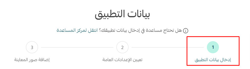
3. Make sure you are on the first page (Enter app details) of the app details steps. You can use the Previous and Next buttons at the bottom of the page to move between pages.
4. Click the field for choosing the icon, and select the icon you designed from your device.
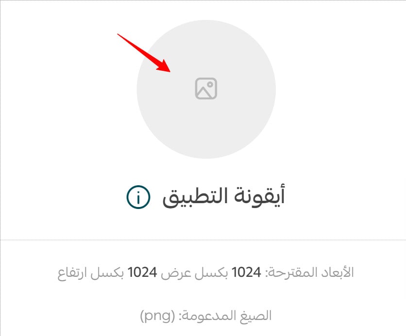
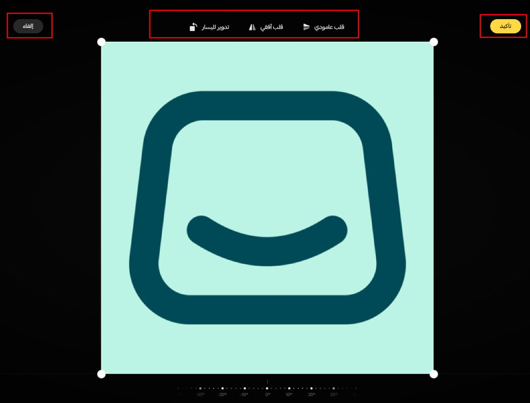
5. Confirm your selection — or rotate, crop, or zoom the image in or out first if you want to adjust it.
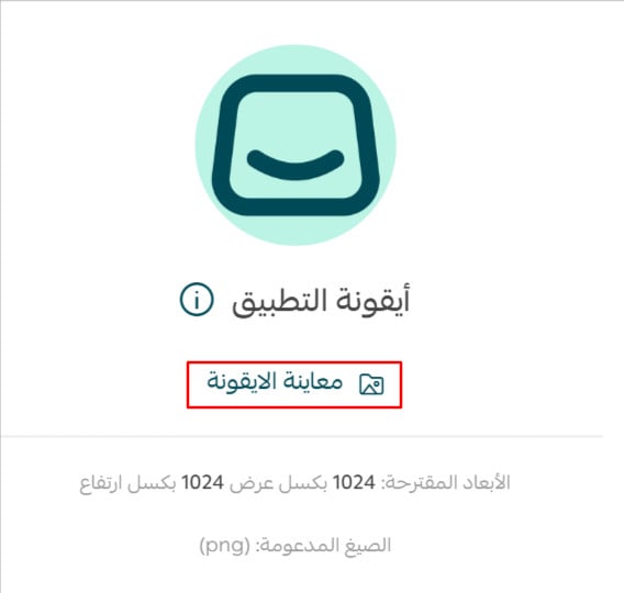
6. The image uploads and appears in its field. You can then click (Preview icon).
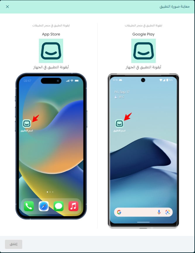
7. You will see an approximation of how the icon appears on both app stores and both operating systems (iOS and Android).
For more details, see Previewing the app from the App Maker page.
❓ Frequently asked questions
What is the fastest and easiest way to choose an app icon?
You can use your store's own icon, adjusted as needed in dimensions and design to meet the requirements listed above.
Can I change the icon after the request is published?
1. Your app icon first goes through a review by the Salla team to check for any obvious issues or violations. You are then notified through App Maker and the technical support chat of any required changes, and you can edit and upload a new icon again.
2. The icon is then examined by Apple's and Google's app store reviewers during the store review stage. It may be rejected if they have any additional specific requirements; in that case, the Salla team will make the icon editable for you again.
3. Finally, once the app request is published and the apps are live on the app stores — that is, the app request status changes to "launched" — the icon can only be changed for an additional fee through the app data update service. For more, see Purchasing an app data update.
Can I update the icon for shopping seasons or changes to my store's identity?
Yes. You can make changes for an additional fee through the app data update service, which appears for you after your app request is launched through App Maker.
It is also a good idea to keep up with events and shopping seasons and adapt the icon's design accordingly — for example, updating the icon with a design that suits the holy month of Ramadan.
Your icon is a one-square-centimeter billboard for your store. Design it to the stores' rules once, and it will earn taps every time a shopper's thumb hovers nearby.