Imagine a customer opening your app with genuine interest, only to be met with cluttered categories and disorganized visuals. In seconds, they lose focus and leave.
Now imagine the opposite: clear categories, structured layouts, and visual cues that guide customers naturally through your products. Browsing becomes effortless, discovery feels intuitive, and customers stay longer and buy more.
That’s the power of well-designed categories.
📌 Article overview
- Designing the home page using the default template
- Category settings
- Category design elements
Designing the home page using the default template
1. Open the App Maker
From the main menu, click Store & Channels, then select Mobile App.
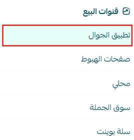
2. Open the Categories Tab
From the app design section, select Categories.
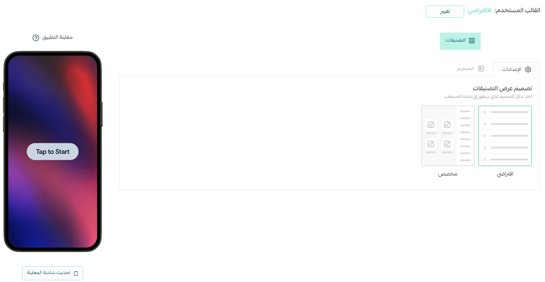
Within the Categories tab, you’ll find two ways to add and manage categories:
- Settings
- Design
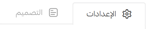
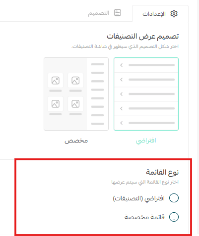
Category Settings
In the Settings section, you can choose how categories are displayed across your app. There are two main display options:
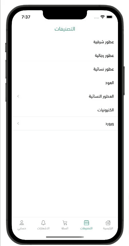
1. Default View
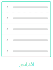
Displays categories as a clean, text-based list, ideal for simplicity and speed.
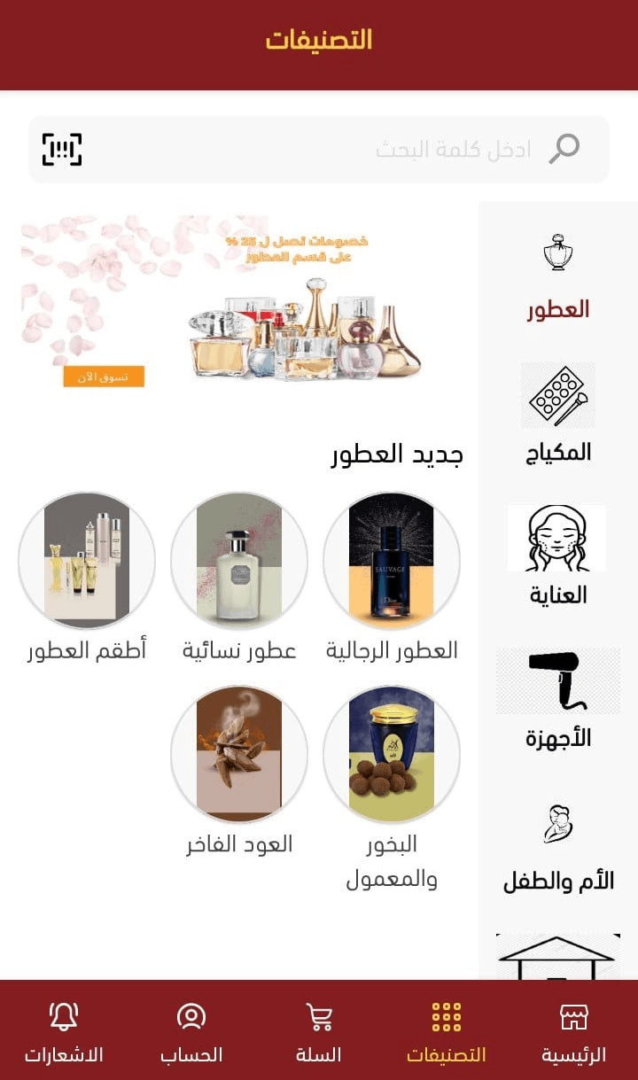
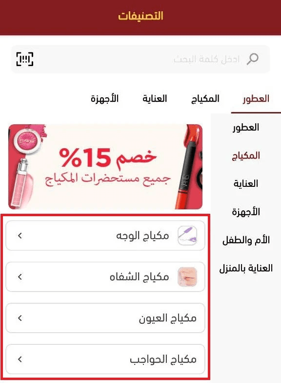
This is how the default category list appears in your app.
Category List Options
You can choose the list type from the following:
- Default Categories: Displays the full list of store categories
- Custom List: Select a predefined category list created earlier in Menu Management and display it in the app
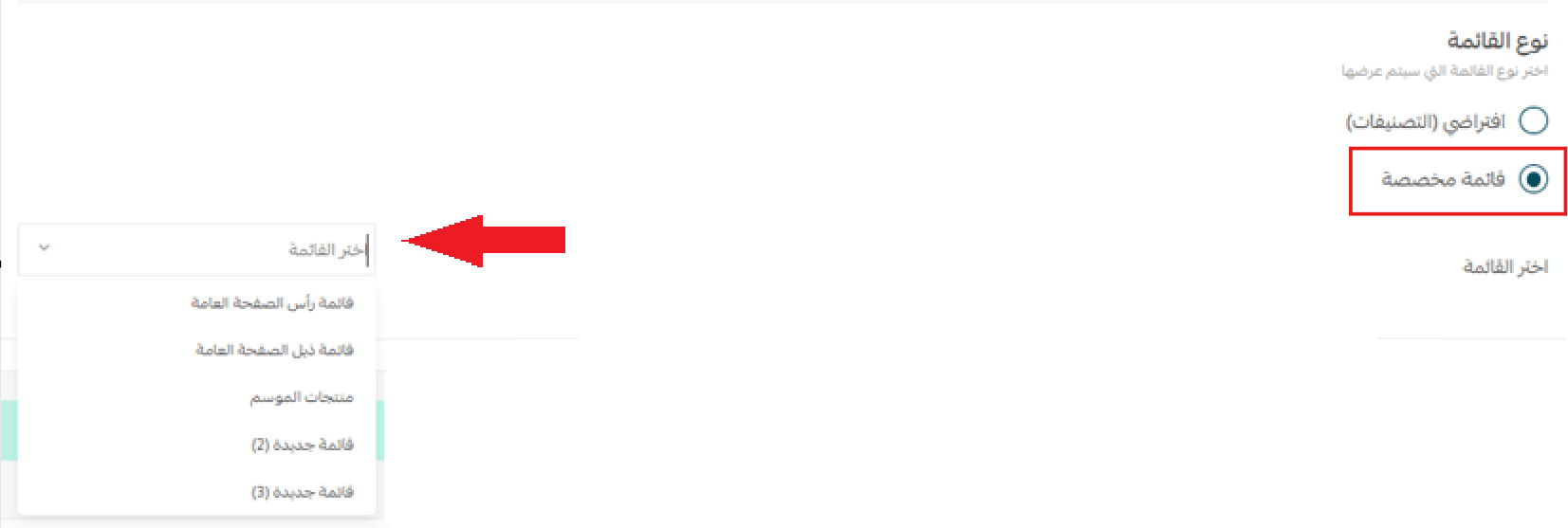
📖 For more details, see Menu Management.
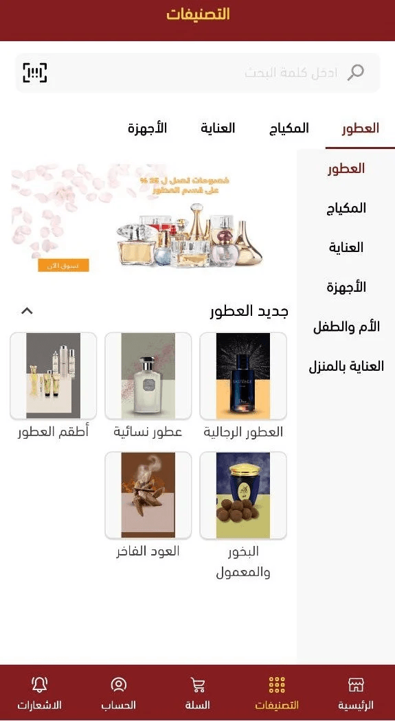
2. Custom View
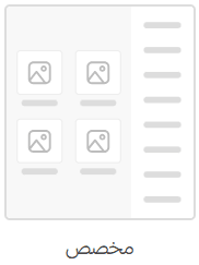
Displays categories using images and icons, creating a more visual and engaging browsing experience.
This option is ideal for stores that rely heavily on visual discovery and brand identity.
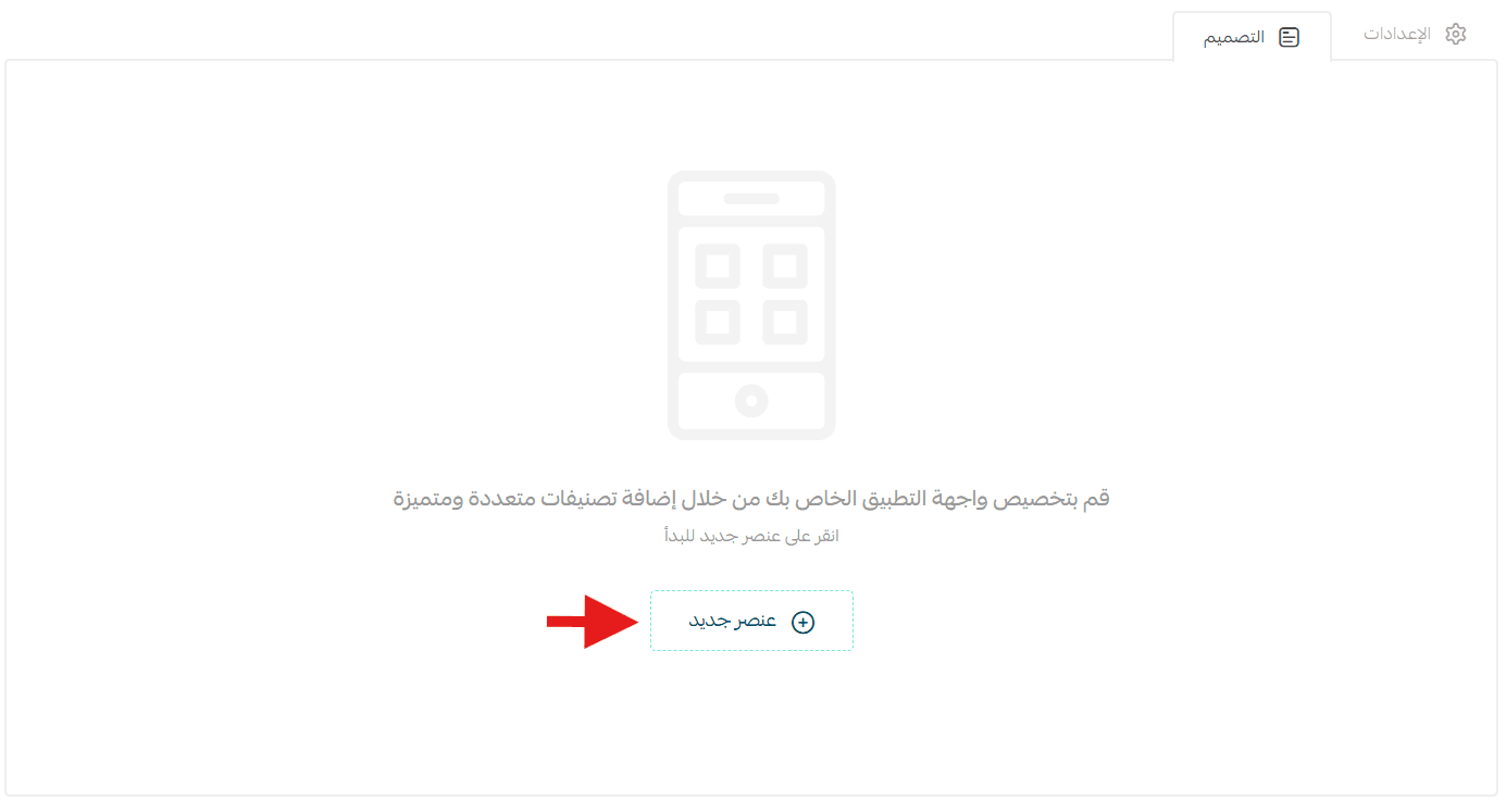
Category Design
To further customize your app’s interface, go to Design and click (Add Element) to start building the category layout that customers see first.
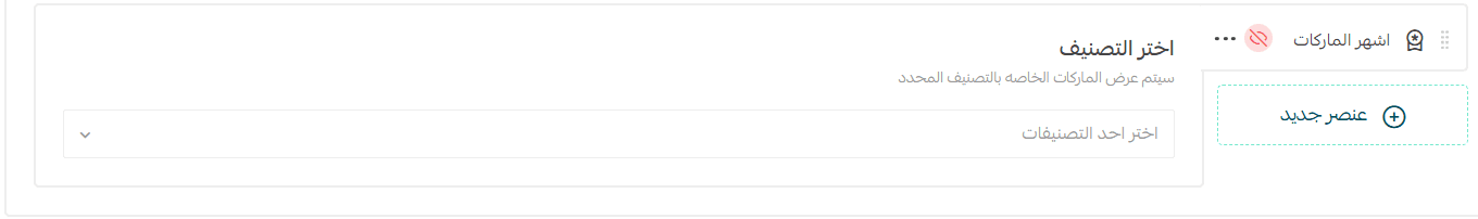
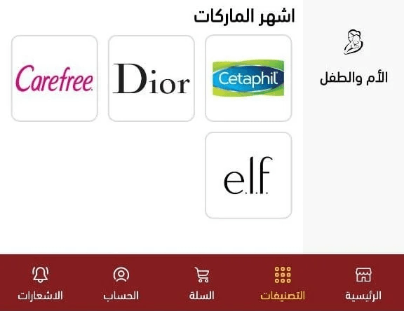
1. Featured Brands/Popular Brands

Select a category, and the most popular brands under that category will be displayed automatically.
This is how brands appear in your app once configured.
2. Item List or Item Grid

Create either a list or grid layout to showcase multiple elements.
Required Fields:
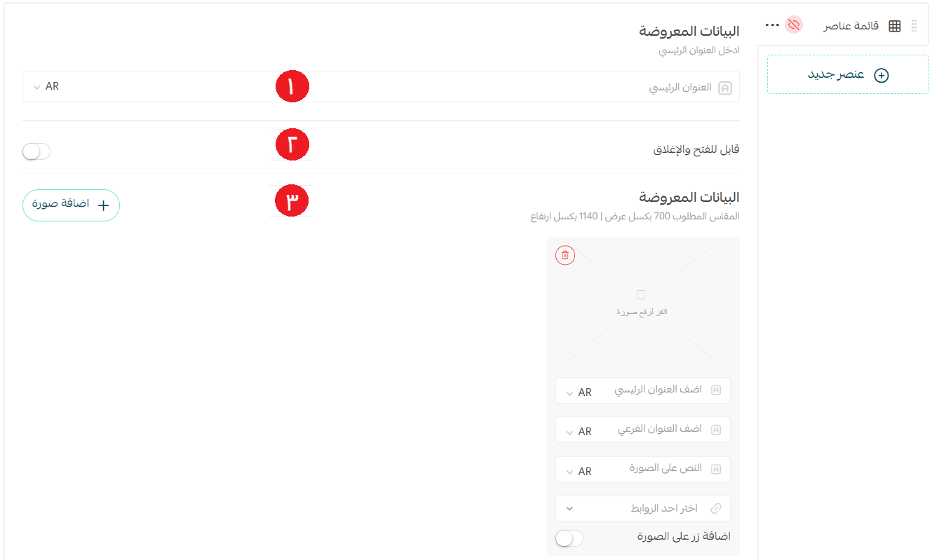
- Title – Optional if the Collapsible option is disabled
- Collapsible Toggle – Enable or disable expand/collapse behavior
- Grid Items – Add images, titles, and destination links
When the collapsible option is enabled, the section appears in the app like this—allowing users to expand or hide content as needed.
3. Text with Image
Add a section that combines text and imagery for storytelling or promotion.
- Enter the section title
- Choose a destination link
- Upload an image (optional)
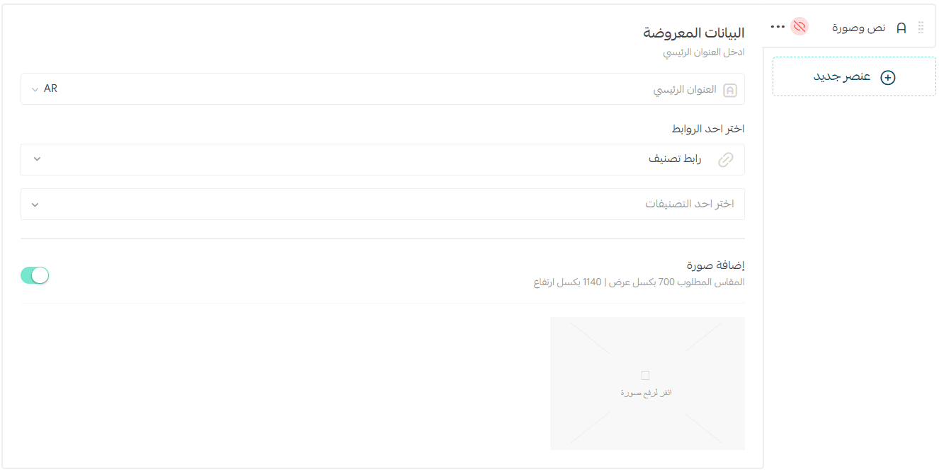
This section can appear with or without an image, depending on your preference.
4. Full-Width Banner

Use a large banner to highlight promotions, collections, or key categories.
- Upload a banner image (recommended size: 1200 × 570 px)
- Add titles and descriptions
- Set a destination link
- Optionally add a call-to-action button on the banner
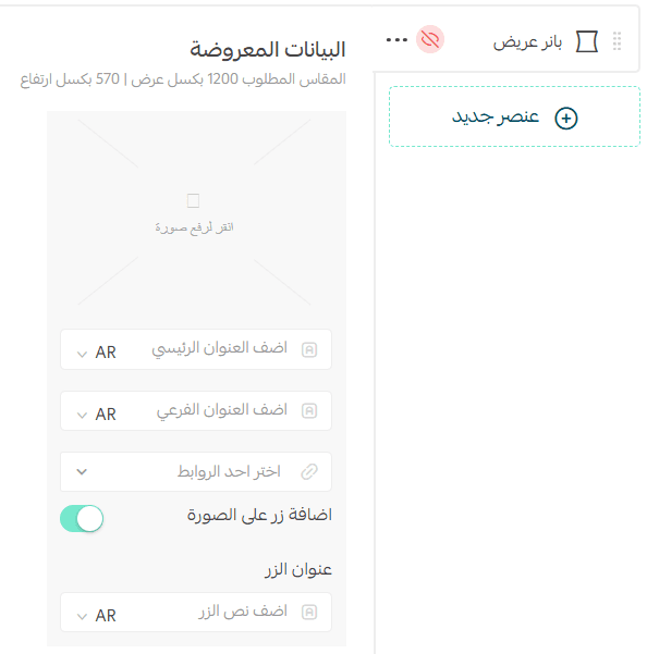
The banner will appear in the app based on your selected layout settings.

Frequently Asked Questions
Are app categories in the new design linked to website categories?
No. Categories created using the new app design method are independent from website categories. Any changes made here do not affect the web store.
Can I switch back to the old category layout if the custom design doesn’t suit me?
Yes. You can always revert to the default category list. The original layout remains available as an option.